


Solutions
Explore how to grow

If 69.4% of the world's Internet use happened on mobile devices in 2023, according to the figure cited in this review of digital evolution, continuing to think of your website as a desktop-centred experience is no longer a tactical oversight. It's a bad business decision (review of the evolution of web design).
If you want to dig deeper, take a look at our web design that converts.
In Chile, that point matters even more. A large share of digital browsing, product research, option comparison and form starts happens on smartphones. That changes the entire conversation. Responsive web design isn't a design matter. It's commercial infrastructure.
When a company operates with a rigid, slow or awkward mobile experience, it pays a silent cost on three fronts. Acquisition friction rises, the likelihood of conversion drops and brand perception deteriorates. The result doesn't always show up as a "design problem" at the board level. It shows up as pressured CAC, stalled sales and a digital channel that doesn't scale the way it should.
The right question isn't whether your site "looks good" on a phone. The right question is whether your digital experience preserves purchase intent, offer clarity and ease of action in any usage context. If it doesn't, your company is losing market share exactly where it actually competes today: on the screen the customer is holding in their hand.
Desktop lost the throne long ago. Many companies still don't reflect that in their budget, their prioritization or their digital product decisions.
The problem isn't conceptual. The problem is financial. When a brand invests in media, content, automation or SEO to drive users to a site that fails on mobile, it turns that investment into leakage. Every paid click that lands on an awkward experience reduces return. Every organic visit that demands zooming, patience or several attempts to complete an action weakens the channel.
Rule of thumb: if most of your users arrive from mobile contexts, the site must be designed to preserve intent, not to compress a desktop version.
Many companies still treat responsive web design as a cosmetic layer. Something reviewed at the end of the project. Something that "gets adjusted" before launch. That mindset is already obsolete. Adaptability must be defined at the outset, because it affects content architecture, performance, visual hierarchy, forms, navigation and purchase.
There's an additional strategic implication. A well-executed responsive site doesn't just avoid losing conversions. It also brings order to the entire digital ecosystem. It makes campaigns easier, reduces inconsistencies across devices, protects the brand and improves the ability to scale changes without breaking the experience. For a growing company, that means less operational friction and more capacity to capture demand.
| Decision | Business consequence |
|---|---|
| Keeping a desktop-first logic | More friction in mobile acquisition and conversion |
| Designing with responsive logic from the start | Better commercial consistency and less channel wear |
| Treating mobile as a late adaptation | Correction costs, rework and lost opportunity |
The most common mistake is to define responsive web design as "a site that adapts to different screens." That description is accurate, but it's far too thin to make good decisions.
Responsive design is a way to ensure that the company's value proposition survives the user's context. It doesn't matter whether the visit happens on an iPhone, a tablet, a laptop or a larger screen. The essentials must stay intact: understanding the offer, trusting the brand and moving toward action without friction.
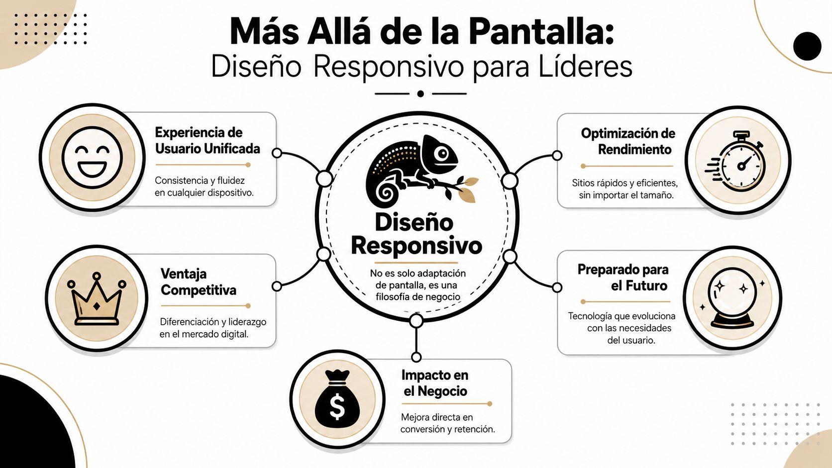
An executive shouldn't think in terms of "versions" of the site. They should think of a single digital system that behaves correctly under different usage conditions.
The useful analogy is that of a liquid. A good responsive system doesn't break when you change the container. It reorganizes priorities, distributes space, adjusts information density and maintains functionality. That matters far more than "looking modern."
When this is done well, three things happen:
A mature responsive site doesn't adapt pixels. It adapts business decisions to the customer's real context.
The technical evolution explains why this stopped being optional. CSS appeared in 1996 and made it possible to separate content and style. Later, the adoption of smartphones in the 2000s made it essential for sites to work well on small screens. The consolidation point came in 2010, when Ethan Marcotte formalized the concept of responsive design, a few years after the launch of the iPhone in 2007. That shift marked the move from fixed pages toward liquid, adaptive systems, the foundation of today's mobile experience (a historical journey through the evolution of web design).
What's relevant for the business isn't the history itself. What's relevant is the conclusion. The market didn't evolve toward more devices to make teams' lives harder. It evolved toward more usage contexts. And a rigid site can't withstand that reality.
Many companies have a site that's "responsive" technically, but not strategically. The interface collapses neatly. The commercial experience doesn't.
That happens when the team manages to make the layout change but doesn't redefine priorities. The result is common: endless menus, blocks of text without hierarchy, forms that ask for too much, overloaded product pages and hidden calls to action. The site adjusts in size, but not in logic.
A well-conceived responsive web design demands a different conversation. It forces decisions about which content deserves prominence, which steps should disappear and which objections need to be resolved first. That exercise improves digital performance because it forces focus.
| Surface-level approach | Strategic approach |
|---|---|
| "Make it look good on a phone" | "Keep intent and convert in any context" |
| Visual adaptation at the end | Commercial prioritization from the start |
| Reviewing screens | Designing system, content and decisions |
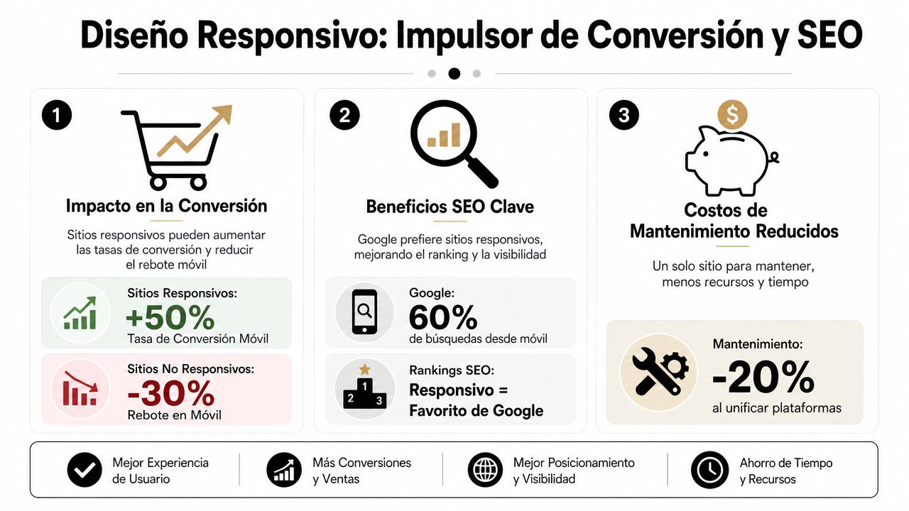
Responsive web design earns a seat at the committee table when it connects with results. And the results here are two: conversion and organic visibility.
No marketing director needs another aesthetic debate. They need to understand why a poor mobile experience makes acquisition more expensive, wastes demand already acquired and limits growth of the organic channel.
Every conversion is a sequence of micro-decisions. Enter. Understand. Trust. Move forward. Confirm. On mobile, that sequence is more fragile because attention is lower, space is limited and any mistake weighs more.
A long form already annoys on desktop. On a smartphone, it drives people away. A small button doesn't just look bad. It interrupts the action. A confusing menu doesn't just clutter navigation. It increases the likelihood of abandonment at the exact moment the user was weighing a purchase or contact.
That has a direct financial consequence. If the responsive experience introduces friction, the company needs more traffic to achieve the same volume of results. In executive terms, the real cost of acquisition rises, even if the CPC or CPM doesn't move.
The warning signs tend to repeat:
The second half of the problem is visibility. If the mobile site delivers a poor experience, the brand doesn't just convert worse. It also loses its ability to be found.
Google evaluates the real experience of the page, and the mobile layer carries decisive weight in how a site competes for organic attention. Poor responsive design hurts readability, structure, loading, navigation and interaction. All of that affects the performance of the SEO channel.
Anyone who wants to dig deeper into how a site's internal structure connects with the ability to rank better should review this guide on on-site SEO and content architecture. The key point for leadership is simple: SEO can no longer be separated from the mobile experience.
A site can have good search intent, the right content and enough authority. If the mobile experience fails, that advantage erodes.
You don't need to get into the technical detail to assess whether responsive web design is adding or destroying value. You need to look at the right indicators and ask the right questions.
| Executive question | Business reading |
|---|---|
| Does conversion change abruptly between desktop and mobile? | There's device-specific friction |
| Do key pages lose clarity or speed on small screens? | The problem is structural, not cosmetic |
| Are paid landing pages and organic pages designed for mobile? | If they're not, you're paying for traffic that doesn't mature |
The most expensive management mistake is assuming that "if the site opens on a phone, it's good enough." It isn't. It must sustain visibility, comprehension and action. If it fails on one of those three, the digital channel performs below its potential.
A leader doesn't need to write CSS. They do need to know when their team is delivering a solid solution and when it's papering over a structural problem.
In Chile, Subtel data shows that mobile browsing and Internet access from smartphones dominate the use of digital services. That's why a serious implementation must prioritize mobile-first, adaptive image loading and an interface that doesn't depend on fixed widths. Technically, that requires combining flexible CSS, media queries and responsive assets to avoid UX degradation on small screens (analysis of responsive design and the mobile context in Chile).
The mobile-first approach isn't a design trend. It's a way to impose discipline. It forces you to prioritize content, reduce noise and build from the essentials.
That changes the quality of internal decisions. When the team starts from the most demanding screen, much of the unnecessary content that tends to sneak into desktop disappears. Navigation gets simpler. Messages become clearer. The architecture stops depending on "available space" and starts depending on commercial priority.
Executive criterion: if a digital proposition can't explain the offer and make action easy on mobile, it isn't well resolved on desktop either. It's just disguised.
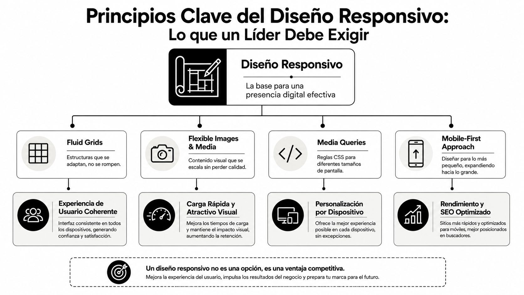
You shouldn't ask for "a responsive site." You should demand four concrete capabilities.
Fluid grids
The site's structure must expand and reorganize without breaking. If the layout depends on rigid widths, the business is tied to old logic. Visual flexibility here represents operational flexibility.
Flexible images and media
Visual assets must keep their clarity without penalizing loading. An oversized image affects speed. A badly cropped one destroys comprehension. Both damage conversion.
Well-resolved media queries
These are the rules that allow the experience to adapt to context. They're not a programmer's detail. They're the mechanism that keeps navigation, forms or modules from becoming clumsy on certain screens.
Performance as a design requirement
Speed isn't reviewed afterward. It's designed. Anyone who wants to better understand how performance and digital commerce intersect in practice can review this guide to web performance for eCommerce.
The quality of an implementation tends to reveal itself more through the questions than through the deliverables.
What did you prioritize for mobile and what did you remove?
If the answer is "nothing," there was no strategy. Just visual compression.
How do you control images, fonts and heavy modules on small screens?
If that isn't defined, performance will depend on chance.
Which critical pages did you test first?
Home, categories, product, form and checkout should be under constant observation.
What system do you use to keep consistency between new pages and components?
Without shared rules, every launch introduces debt.
A serious technical provider can answer this clearly. If they answer with vague jargon, pretty screenshots or general promises, they're not yet talking about business.
The platform isn't an operational detail. It defines how much control your company will have, how much technical debt it will take on and how quickly it can correct friction when it appears.
In Chile, eCommerce already exceeds 13% of retail sales, according to the figure gathered in this guide on responsive design and digital commerce. At the same time, much of the market conversation is still stuck on breakpoints, Flexbox or Grid, when the real problem lies in forms, tap targets and checkout (analysis of responsive design and Chilean eCommerce). That distinction matters. The right platform isn't the one that "allows responsive." It's the one that makes it easy to correct commercial friction quickly and consistently.

WordPress offers breadth. That's its strength and its risk.
For companies with complex content needs, diverse integrations or hybrid acquisition models, it can be a powerful foundation. The problem appears when the organization confuses flexibility with an absence of rules. Bloated themes, heavy builders and an accumulation of plugins tend to degrade performance and responsive coherence over time.
WordPress works best when there's technical judgment, component governance and a clear performance policy. Without that, the platform amplifies the disorder.
Webflow attracts teams that need deployment speed, design control and less dependence on the traditional development cycle for certain changes.
Its advantage is clear. It lets you work the responsive experience with a high level of visual precision. Its limit is just as clear. If the company doesn't have a system logic, the site can end up beautiful but hard to scale when content, campaigns or personalization needs grow.
For marketing organizations focused on brand, speed and interface governance, it tends to be a solid option. In fact, providers like Bigbuda work on this kind of strategic development in Webflow and WordPress as part of a broader offering of digital growth, support and continuous optimization.
Shopify starts with a structural advantage for eCommerce. Its ecosystem is oriented toward purchase. That simplifies many critical decisions and reduces the margin for error in core commercial flows.
The flip side is the depth of customization. Shopify scales very well when the company accepts working within a more controlled logic. It becomes more complex when the business wants to deeply alter certain behaviours or build experiences outside the typical store pattern.
For many brands that sell online, that isn't a disadvantage. It's a smart decision. A more closed environment can mean less debt and greater speed to iterate on what actually matters: conversion, catalogue, promotions and operations.
The useful comparison isn't "which platform is better." The useful comparison is "which platform penalizes my objectives the least."
| Platform | When it makes sense | Main risk |
|---|---|---|
| WordPress | Businesses with high content flexibility and integrations | Technical debt from plugins and poor governance |
| Webflow | Teams that value visual control and speed of change | Limited scalability without a system |
| Shopify | eCommerce focused on selling quickly with operational order | Restrictions on deep customization |
The right choice depends on your business model, the maturity of your team and the speed at which you need to iterate. The ideal platform isn't the most popular one. It's the one that sustains growth without turning every improvement into a technical negotiation.
Launching a responsive site doesn't solve the problem. It only creates the possibility of solving it well.
The real advantage appears when the company measures by device, detects specific friction and adjusts the experience continuously. Without that cycle, responsive web design becomes a project checkbox. And a checkbox doesn't produce sustained growth.
Looking at aggregate metrics is convenient. It's also dangerous.
If desktop offsets poor mobile performance, the average can look acceptable while the company loses business every day. That's why the right reading separates behaviour by device and by funnel stage.
The metrics that deserve leadership attention include:
If a company doesn't segment UX and CRO by device, it's managing an average. It isn't managing an experience.
The most expensive problems almost never show up in a visual review meeting. They show up in behaviour.
Heatmaps help you see where people tap, ignore or try to interact without success. Session recordings let you spot blockers that the internal team no longer sees out of familiarity. Scroll analyses show whether the value proposition and the call to action are too far down or poorly prioritized.
It's also worth observing differences by context. A tablet doesn't behave the same as a phone. A returning user doesn't browse the same as a new one. A paid-campaign visitor needs less exploration and more immediate clarity.
The true strategic use of a responsive site is to enable learning. A serious team doesn't just ask whether a page "works." It asks which version reduces friction, which content order improves decision-making and which component needs a redesign.
That turns the site into a living asset. And that's where competitive advantage begins, because most companies launch, celebrate and freeze.
For teams that are already ready for that level, it's worth structuring hypotheses and tests with discipline. This guide on A/B experiments in eCommerce offers a useful look at how to turn interface decisions into commercial learning.
A simple framework for a digital committee can look like this:
| Area observed | Key question |
|---|---|
| Primary CTA | Is it easy to find and tap on mobile? |
| Form | Does it ask for more than necessary to move forward? |
| Product page | Does it help decide or just pile up content? |
| Checkout | Does it reduce effort or multiply steps and doubts? |
Measuring isn't a technical exercise. It's a leadership practice. Companies that treat their mobile experience as a system to be reviewed, learned from and improved end up operating with an advantage that doesn't depend on raising the advertising budget.
Responsive web design no longer belongs in the category of desirable improvements. It belongs in the category of mandatory infrastructure for competing in digital.
Its impact doesn't end with the site looking tidy on mobile. It affects how a company acquires customers, how much of its media investment it wastes, how well it converts existing demand and how much consistency it maintains across brand, product and experience. That combination influences CAC, commercial efficiency and the ability to grow without multiplying operational friction.
It's also worth looking a little further ahead. The principles that underpin good responsive web design, such as fluidity, prioritization, adaptability and context, are the same ones that prepare an organization for new interfaces. In-vehicle screens, voice assistants, wearable devices and more immersive environments will demand experiences that no longer depend on a single format.
The future won't reward companies with more pages. It will reward companies with digital systems capable of adapting without losing clarity, speed or the ability to convert.
The executive conclusion is simple. If your organization still treats responsive as a visual deliverable, it's running late. If it treats it as a commercial architecture decision, it can still gain ground. The brands that understand that difference build digital assets that are more resilient, more efficient and better prepared to capture real growth.
If your company needs to convert the traffic it already has more effectively, Bigbuda can help align responsive web design, performance, CRO and digital strategy in WordPress, Webflow or Shopify, with a focus on measurable growth and data-driven decisions.
Related article: 2026 Guide: how much does it cost to build a website in Chile