


Solutions
Explore how to grow

If your company still treats reporting as a recap of what already happened, you have a management problem, not a visualization one. The question is not whether you can see the data. The question is whether that data lets you decide faster than your competition, fix misalignments between marketing and sales, and spot profitability leaks before they become structural.
Need help with this? Explore our digital marketing service.
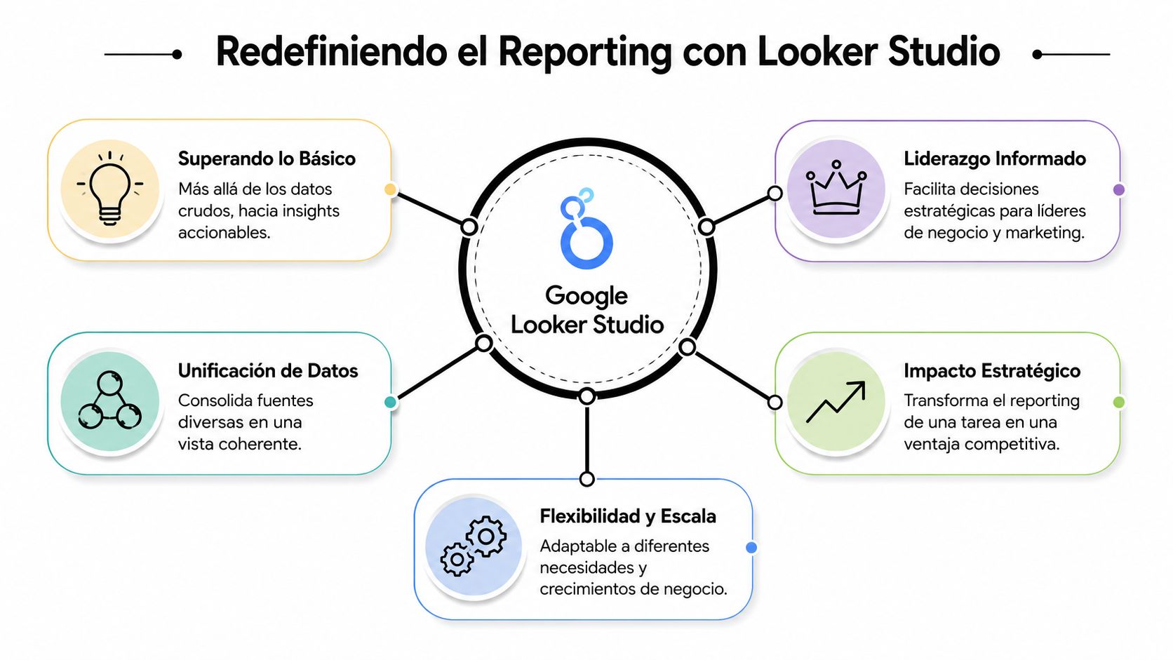
Google Looker Studio matters precisely for this reason. Not because it produces good-looking dashboards, but because it can turn scattered information into a shared executive view. Used well, it brings order to the business conversation. Used poorly, it dresses up analytical chaos with elegant charts.
Google Looker Studio should not be assessed as a simple reporting tool. It should be assessed as a decision layer. That is the difference between a team that reports activity and a team that drives growth with judgment.
Google Looker Studio is a free tool that lets you combine multiple datasets into interactive reports. On top of that, its ecosystem exceeds 600 partner connectors and supports more than 800 different data sources, making it easier to centralize analytics, CRM and other platform data in a single dashboard, according to the Digital Culture Network guide on Google Looker Studio.
The real value is not in merging sources just for the sake of merging them. It is in removing the fragmentation that forces each team to defend its own version of reality. Marketing looks at Ads. eCommerce looks at sales. Sales looks at the CRM. Operations looks at spreadsheets. The CEO receives incompatible versions of the same business.
With Google Looker Studio, that fragmentation can become a shared view. Not a perfect truth, but a common basis for discussing investment, commercial efficiency, lead quality, catalog behavior and performance by channel without depending on constant manual exports.
If every team shows up to the meeting with its own number, the problem is not the data. It is the reporting architecture.
This has a clear executive implication. As the business grows, so does the cost of misreading information. A misaligned report does not just create confusion. It pushes bad decisions about budget, timing and prioritization.
Most companies do not need more dashboards. They need less friction between question and answer. Google Looker Studio speeds up that stretch because it brings data closer to decision-makers without always requiring technical mediation.
That does not replace a data strategy. It makes it visible. That is why it pays to treat the tool as a management asset and not as an analytics deliverable. If you want to dig deeper into that framework, it is worth reviewing this guide on what Looker Studio is in eCommerce.
Three strategic effects appear when it is used well:
Google Looker Studio does not solve data quality on its own. But it does make it very quickly visible when the company is deciding with useful data and when it is improvising with decorative reports.
A dashboard is only worth it if it answers uncomfortable questions. In eCommerce and marketing, the most important ones are rarely tactical. It is not enough to know how many campaigns are active or which channel brought the most sessions. What matters is understanding which part of the system is generating margin and which part is draining budget.

Picture an online store that sells across several channels and runs paid campaigns continuously. It has data in GA4, in the advertising platform, in its ecommerce and in its CRM. The common mistake is to look at each system separately and assume the final result can be understood by adding up screenshots.
With Google Looker Studio, a marketing director can read a complete sequence. Which channel generated demand. Which traffic arrived with real intent. Which pages concentrated drop-off. Which campaigns brought higher-quality sales. And which downstream commercial signals confirm or contradict marketing's apparent success.
That changes the conversation. The question stops being “which campaign got the most clicks” and becomes “which investment generated the best commercial result with the least friction.”
Not everyone should read the same dashboard. A CEO needs synthesis. A growth team needs diagnosis. When both use the same tool but with different layers of reading, reporting stops being operational noise.
One useful way to split the view is this:
| Profile | What they need to see | What decision it enables |
|---|---|---|
| CEO or general management | Revenue trends, channels, efficiency and misalignments | Reallocate focus, budget and owners |
| Marketing leadership | Performance by channel, campaigns, funnels and behavioral variations | Cut inefficient spend or scale what does deliver |
| eCommerce manager | Performance by category, product, device and navigation friction | Prioritize catalog, UX or assortment improvements |
A good dashboard for leadership does not show everything. It shows what forces a decision.
In eCommerce, this also helps read the health of the catalog. If certain categories attract traffic but do not convert, the problem may lie in pricing, content, mobile experience or purchase expectation. If a campaign looks efficient on the platform but does not deliver useful sales, the problem may lie in how success was defined.
In B2B marketing, the logic shifts from direct sales to pipeline quality. The useful dashboard does not reward raw volume. It rewards consistency across acquisition, intent and commercial progress.
Google Looker Studio stands out when it helps compare those layers without turning every meeting into a debate about where the data came from. That is when it starts to operate as business infrastructure. Not as report design.
The first mistake when building a dashboard is opening the tool before having a business question. That produces dashboards full of orphan metrics. The second mistake is copying a template and assuming a decision logic already exists. It does not.
Google documented the evolution from Google Data Studio to Looker Studio within its analytics portfolio. In that evolution, the platform stands out for enabling near real-time analysis. In addition, reports can include date-range controls defaulting to 28 days and comparisons against the previous period or the prior year, as Google Cloud explains regarding the move from Data Studio to Looker Studio.
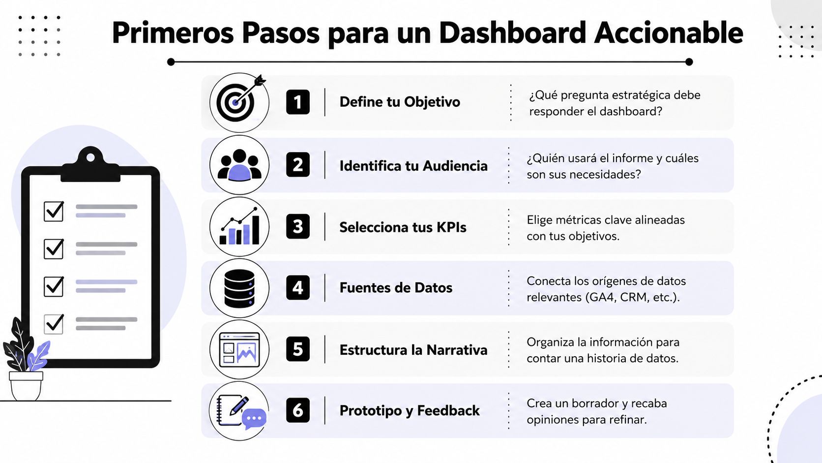
If the dashboard is not designed for a concrete decision, it will be a visual repository. Nothing more. Before connecting GA4, CRM, Ads or spreadsheets, define which business tension you want to clarify.
Ask yourself questions like these:
If data capture is messy, fix it before making the visualization more sophisticated. In many cases, the problem starts with measurement. A reasonable baseline usually requires order in events, naming conventions and tagging. That is where an earlier implementation discipline also comes in, such as the kind that a Google Tag Manager strategy can support.
An actionable dashboard does not try to impress. It tries to guide. That demands visual hierarchy and logical narrative.
Practical rule: put the result first, then the context, and only at the end the explanatory detail.
A useful structure for leadership usually follows this order:
Main result
What the business needs to watch first. Sales, qualified leads, commercial efficiency or an equivalent signal.
Result drivers
Channels, categories, campaigns, segments or sources that explain that behavior.
Friction points
Where the journey breaks down. Drop-off by device, weak traffic sources, measurement mismatches or sudden changes.
Time-based comparison
An isolated figure is of little use. Comparative reading helps distinguish normal variation from relevant change.
Templates can speed up the start, but they do not replace judgment. Use them as a draft. Adapt fields, filters, language and level of detail to the way your company decides. If you do not do that, you will have a dashboard that looks functional and is sterile in practice.
In CRO, the problem is not a lack of data. The problem is the inability to read where purchase intent breaks down. Google Looker Studio adds value when it stops acting as a retrospective dashboard and starts working as a diagnostic surface.

A good conversion dashboard does not limit itself to showing sessions, transactions or submitted forms. It cross-references signals to detect friction. If a page receives qualified traffic but loses users before they advance, there is a hypothesis to investigate. If mobile concentrates drop-off and desktop does not, there is already an operational priority. If certain sources promise intent but do not sustain conversions, the investment needs review.
The executive usefulness of this is strong. It allows better prioritization. Instead of spreading optimization efforts based on internal intuition, the team can focus on the stretches of the funnel with the greatest impact on the result.
A CRO-focused dashboard should help answer questions like these:
Google Looker Studio does not do CRO for you. But it does organize the evidence so the team stops testing arbitrary changes. That is a real competitive edge, because it speeds up the transition from opinion to hypothesis.
Here it pays to be strict. If the conversion dashboard only shows final indicators, it arrives too late. If it shows sequence, segmentation and friction, it does help move the business. At that point, visualization becomes a tool for strategic prioritization.
The teams that optimize best do not necessarily have more data. They have a better reading of where to act first.
For a company focused on commercial efficiency, this is more valuable than piling on traffic without criteria. Optimizing conversion requires distinguishing between symptom and cause. Google Looker Studio is useful when it makes that difference visible and forces decisions to be made on an analytical basis, not on internal preferences.
The public conversation about Google Looker Studio usually stays on the easy side. How to connect sources. How to copy templates. How to build pretty views. That is the surface. The serious problem appears when the tool becomes the center of reporting and no one takes ownership of its operational fragility.
Looker Studio supports data blending with join operators such as Left, Right, Full Outer, Inner and Cross join, but it requires that dimensions share consistent names and that dates use the same display format. If that is not modeled well, duplicates or lost records appear when cross-referencing tables, as this analysis on blending in Looker Studio explains.
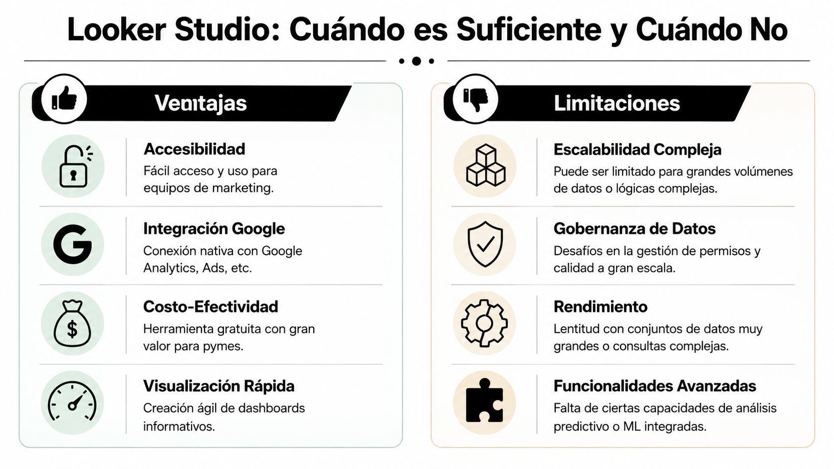
Connecting several sources is easy to sell and hard to govern. Each new connector adds dependency. Each blend adds points of failure. Each calculation created inside the report complicates data traceability.
That cost is not always visible at the start. But it grows as the business adds channels, markets, catalogs, teams or stakeholders. At that point Google Looker Studio remains useful as a visualization layer, but it stops being sufficient as a source of truth for critical decisions.
Frequent warning signs:
When the dashboard depends on patches, the business already needs architecture.
Not every company should migrate to a more advanced analytical layer right away. But many reach that decision too late. The right criterion is not “whether it still works.” The criterion is “whether it still allows confident decision-making.”
When there is high catalog turnover, omnichannel campaigns, a demand for data quality control or multiple critical sources, Looker Studio usually performs better as a visual last mile than as the logical core of the system. At that point it pays to move the transformation and consolidation logic to a more solid foundation, leaving Looker Studio for consumption and reading.
For some teams, one alternative is to formalize permissions, distribution and collaboration better with Looker Studio Pro. For others, the next step will be an architecture with analytical storage and stricter governance. Bigbuda can even take part as an option in that process when a company needs to bring order to measurement, reporting and executive reading within a broader growth ecosystem.
The recommendation is simple. Use Google Looker Studio with ambition, but not with naïveté. It is very useful. It is not useful for everything. And the sooner you recognize that limit, the less costly it will be to scale.
The most common mistake with Google Looker Studio is treating it as a visual deliverable. Its real value appears when it is integrated into the company's decision system. There it stops being a collection of charts and becomes a piece of management.
For a CEO, that matters because growth does not fail only from a lack of investment. It also fails from poor reading. Teams operating with fragmented data tend to react late, prioritize poorly and debate metrics instead of debating decisions. A well-designed reporting environment reduces that friction.
The right conclusion is not that Google Looker Studio solves the entire data strategy. It does not. It makes it operable, visible and shareable. That contribution is already enormous. But it demands discipline: good measurement, coherent definitions, clear limits on when to blend data, and the judgment to know when to evolve the architecture.
The companies that grow with more consistency are not the ones with the most dashboards. They are the ones that turn signals into decisions, and decisions into coordinated actions.
If your company needs to turn scattered reporting into a clearer decision system, Bigbuda can help bring order to measurement, visualization and growth focus for eCommerce, marketing and digital teams that no longer want to keep operating blind.