


Solutions
Explore how to grow

The worst advice about UX and UI still circulates in marketing committees and boardrooms: "make it look better." That logic destroys profitability because it evaluates design as makeup and not as a conversion system.
At Bigbuda we help you with turning traffic into sales with CRO.
A site can look impeccable and still lose sales every day. All it takes is confusing navigation, forms that ask for too much, weak visual hierarchies, or slow screens to turn paid traffic into waste. The problem is not aesthetic. It is financial.
UX and UI affect revenue, cost of acquisition, conversion rate, and commercial efficiency. That is why treating them as a creative expense separate from performance is a bad management decision. The experience defines how much real value the company captures from traffic, demand, and media investment.
That is the point many teams still overlook when talking about what CRO is and why it impacts digital profitability. If the experience fails, paid media only buys more friction.
In Chile, where the digital channel already plays a central role in growth, this mistake costs more than before. The more online competition, the lower the user's tolerance and the greater the pressure on returns. The consequence is simple. A bad experience no longer just lowers conversions. It also forces you to invest more to get the same result.
Bigbuda works on this problem from a business logic, not an ornamental one. The right combination of UX and UI lets you detect frictions, prioritize improvement opportunities, and turn design into a concrete tool to grow with more margin.
The mistake is not in valuing design. The mistake is in measuring it poorly.
Many teams approve redesigns by internal perception. "It looks more modern," "the brand now feels more premium," "the home is cleaner now." None of those phrases answer the only thing a CEO or Marketing Director should ask: does this improve revenue, commercial efficiency, or retention?
UX defines how a person advances from intent to action. UI determines whether that action is perceived as clear, trustworthy, and easy. Separating them is absurd. The user does not experience those disciplines separately. They experience a complete experience, and that experience impacts the entire business.
That is why the right debate is not design versus performance. The right debate is how to use design to capture more value from traffic already paid for. That is the logic of what CRO is and why it affects digital profitability.
If your company depends on paid media to grow, then UX and UI are no longer a creative matter. They are a direct lever to protect margin.
A bad experience does not just reduce conversions. It also distorts business decisions. It makes you believe traffic is missing when in reality there is excess friction. It makes you scale paid media when the problem is in navigation, clarity, load times, or visual hierarchy.
The most mature teams understand something simple:
Smart investment does not start by buying additional attention. It starts by raising the performance of the digital asset that already receives visits.
Separating UX and UI in daily management can be useful for assigning roles. Separating them in strategy destroys performance.
The user does not distinguish disciplines. They perceive a single experience. If they understand what to do, trust, and move forward, the business wins. If they hesitate, get lost, or misread the interface, conversion drops even as traffic investment keeps rising. That is why, at Bigbuda, we treat UX and UI as a growth system, not as two creative fronts.
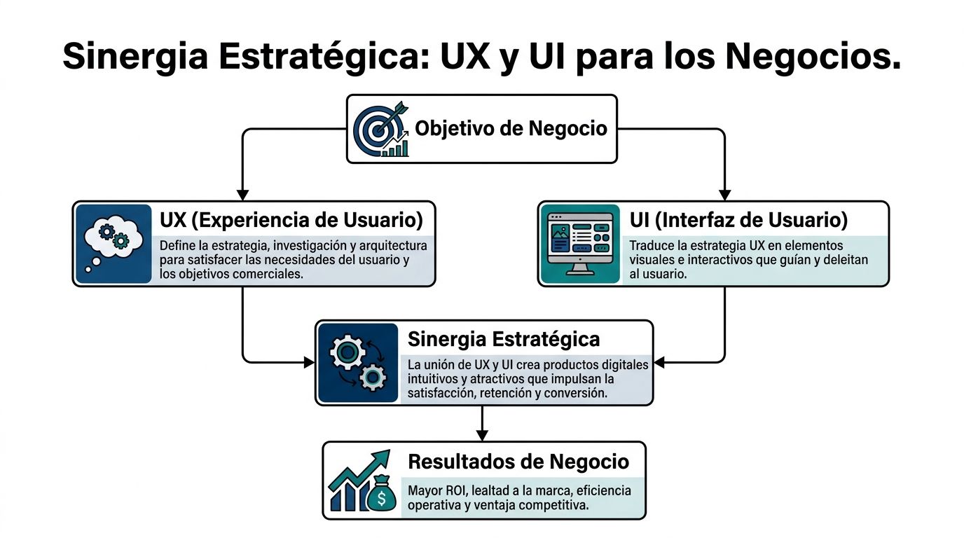
UX organizes the commercial logic behind the experience. It decides how a person moves from a concrete need to an action that is profitable for the company.
That requires answering questions with direct business impact:
Here, decisions about information architecture, message prioritization, flows, journeys, and the definition of critical tasks are at stake. If this base fails, the interface only masks a structural problem.
UI executes. It turns strategy into visible and understandable signals. It defines hierarchy, contrast, spacing, error states, component consistency, form design, and the clarity of calls to action.
A good interface reduces cognitive load. It makes the next step obvious. It reinforces trust without demanding extra effort.
That point matters more than many boards admit. A visually impeccable interface that does not guide holds back sales. A sober interface, well organized and aligned with the user's intent, usually produces better commercial results.
The evolution of digital design consolidated a simple idea. The interface gained value when it began to facilitate real tasks, not when it sought to look more sophisticated.
From ergonomics applied to systems to the first graphical interfaces popularized in personal computing, the relevant advance was always the same. Less friction. Less interpretation. More control for the user. Later, the digital products that drove mass technology adoption did exactly that: they simplified complex interactions until they became natural.
The lesson for a CEO or Marketing Director is practical. The market rewards experiences that help people decide and act quickly. It does not reward visual layers disconnected from commercial intent.
Do not ask for "a more modern proposal." Ask for alignment between business, experience, and interface.
That means reviewing whether the design is connected with metrics, hypotheses, and an operational reading of the funnel. If your team still evaluates screens by internal taste, you are behind. If it evaluates them by impact on conversion, retention, and decision speed, you are already managing design as an investment. A useful way to organize that tracking is to centralize indicators in a Looker Studio dashboard for performance and conversion.
Use this quick test:
QuestionIf the answer is noDoes the structure help complete key tasks?You have a UX problemDoes the interface make the next step obvious?You have a UI problemWere both decisions made with commercial judgment?You have a leadership problem
The user does not buy "good UX" or "good UI." They buy clarity, trust, and ease of moving forward.
A CEO should not approve redesigns by visual taste. They should demand evidence of impact on conversion, commercial efficiency, and margin.
That is where decorative design separates from design that contributes business. The integration between UX and UI has value when it reduces friction in critical tasks, accelerates decisions, and improves the advance rate in the funnel. If that cannot be measured, it cannot be defended in committee either.

In eCommerce and demand generation, it is worth stopping looking only at traffic, general bounce, or time on page. Those indicators show activity. They do not explain whether the design helps sell.
Look at operational metrics that have a direct relationship with commercial results:
Do not evaluate this data as isolated design metrics. Use it as indicators of commercial efficiency.
If a campaign brings users with intent and those users do not complete the expected action, the problem is not always in the offer or the channel. Often it is in the experience. Confusing forms, weak visual hierarchy, unnecessary steps, ambiguous messages, and poorly resolved CTAs turn paid demand into avoidable loss.
That is the point many teams do not manage well. They keep investing in acquisition while leaving intact the friction that blocks conversion.
In many companies, marketing reports campaigns, sales reports pipeline, and product reports usage. No one unites experience with profitability. That is how partial decisions get made.
The solution is simple. Centralize UX, UI, conversion, and revenue metrics in a single framework of executive reading. A leadership team needs to see which part of the journey is holding back revenue and how much that friction costs. To organize that analysis, it is useful to build a Looker Studio executive dashboard for performance, conversion, and marketing decisions.
If your dashboard does not connect friction, abandonment, and revenue loss, you are measuring activity. Not growth.
You do not need to inflate the report with dubious figures to justify an improvement. You need discipline to relate experience to result.
If the user does not complete key tasks, the error rate rises, or they take too long to advance, there is a design problem with financial impact. If the experience is also perceived as confusing or untrustworthy, that impact multiplies across forms, checkout, landings, and commercial contact flows.
The recommendation is concrete. Define a baseline for Task Success Rate, errors, time on task, and SUS in the flows that produce the most revenue. Then prioritize redesign and experimentation on those points, not on internal opinions.
Design without metrics is cost. UX and UI measured against conversion, retention, and commercial efficiency become a real lever of ROI.
Speed does not belong to the technical backlog. It belongs to the P&L.
If a page is slow to respond, the experience breaks before the user evaluates the offer, the price, or the value proposition. At that point, UX and UI stop being a design conversation and become a revenue conversation.

Every second of waiting introduces friction at the most sensitive moment of the journey. The user loses focus, questions the site's reliability, and postpones the action. In eCommerce, that hits the cart and the checkout. In B2B, it reduces form submissions, scheduled demos, and quality commercial contacts.
The mistake of many companies is treating speed as an infrastructure problem, isolated from UX and UI. That separation blocks growth. A clear interface that loads late converts worse. A good experience architecture on a slow base also converts worse. Real synergy demands both things at the same time.
Core Web Vitals serves to measure how quickly the user perceives value and how stable the interface feels while they try to move forward. That affects behavior. And behavior affects revenue.
A director does not need to review every technical detail. But they do need to demand three things:
That standard improves conversion because it reduces cognitive friction. It also improves commercial efficiency because it better filters the user's real intent.
Do not measure speed as a collection of loose metrics. Measure it in terms of the flows that produce revenue.
Prioritize home, campaign landings, PDP, cart, checkout, and contact forms. Then cross performance with abandonment, error rate, scroll, CTR, and assisted conversion. That analysis shows where slowness is holding back business and which correction offers the fastest return.
To review that front with more strategic judgment, it is worth grounding it in an evaluation of web performance for eCommerce oriented to conversion and experience.
A fast experience does not just sell more. It reduces operational friction.
When the interface responds well, the user needs less support, makes fewer mistakes, and reaches the next step with more clarity. That lowers the commercial and customer-service load. It also improves lead quality, because it eliminates abandonments caused by avoidable failures and makes real demand visible.
At Bigbuda, this point is worked on as a growth discipline. Performance, UX, and UI are corrected on the same priority system, with behavioral data, clear hypotheses, and continuous experimentation. This way, speed stops being a pending technical task and becomes a direct lever of CRO and ROI.
A fast site protects commercial intent. A slow site degrades it before the business has a chance to convert.
The redesign treated as a closed project destroys value. A new interface is approved, published, and the team expects the business to improve by inertia. That is not strategy. It is an expensive gamble.
Serious work on UX and UI functions as a growth system. It starts with evidence, turns into a hypothesis, and ends in validation against business metrics. If that circuit does not exist, the company is not investing in optimization. It is funding internal preference.
The real problem is not a lack of visual talent. It is the disconnect between research, design, and commercial results.
The reference from UC San Diego Extended Studies on UI and UX principles raises a frequent gap: teams gather information about audience and experience, but do not always turn it into decisions that impact conversion. For a CEO or Marketing Director, that gap is unacceptable. If the digital channel concentrates the relationship with customers, UX and UI must answer for revenue, efficiency, and return.
Figma comes later. First you have to define where money is being lost and which change can recover it fastest.
That process organizes investment. It also reduces one of the most expensive leaks in digital marketing: launching changes without the ability to attribute their effect.
AI does not decide the strategy. It accelerates the time between signal, analysis, and action.
Used well, it helps classify behavior patterns across thousands of sessions, detect anomalies in funnels, suggest segments with different intent, generate variants for tests, and prioritize hypotheses based on historical behavior. That reduces operational time and increases the number of experiments the team can run with judgment.
Used poorly, it produces generic interfaces, undifferentiated messages, and more visual noise. Profitability does not appear from using AI. It appears from using it within a clear decision system.
The company that validates faster reduces the cost of learning. The company that redesigns by intuition turns budget into operational debt.
This model demands governance. UX and UI cannot depend on isolated areas with different objectives. Marketing seeks volume, product seeks order, technology seeks viability. Someone has to align those decisions with profitability.
That is why mature conversations about UX and UI look less like an aesthetic review and more like a growth committee. They discuss frictions, intent, clarity, abandonment, lead quality, advance rate, and the return expected per improvement.
Bigbuda can participate in that process by integrating data, UX, experimentation, and AI on Shopify, WordPress, or Webflow. The underlying point is another. The company that connects research, design, and validation gains speed to learn, corrects before its competition, and converts the traffic it already pays for more effectively.
Design that does not improve revenue is decoration. In eCommerce and B2B, the difference between growing or stalling usually lies in how UX and UI reduce friction at points that impact sales, lead quality, and commercial efficiency.

An online store can invest well in acquisition and lose margin at checkout. The problem is rarely a single big error. It is usually a chain of small frictions: unnecessary fields, unclear validations, costs that appear late, buttons without hierarchy, and a mobile experience that conveys little security.
UX fixes the sequence. UI makes clear what to do and why to continue.
That adjustment changes the business. Purchase completion rises, abandonment drops, and the return on the traffic the company already paid for improves. In CRO terms, that is worth more than continuing to buy visits to compensate for a poorly resolved flow.
It also changes the quality of the operation. Fewer errors in forms, fewer doubts during payment, and less dependence on support to close a sale that should have completed on its own.
In B2B, the cost of a bad experience is not measured only in lost forms. It is measured in weak pipeline, low-intent meetings, and sales teams spending time on leads that did not understand the proposition.
The pattern repeats. A home with generic messages, navigation built from the company's internal structure, lengthy service pages, and CTAs that compete with each other. The visitor arrives with a concrete question and the site responds with ambiguity.
UX organizes the information architecture according to purchase intent. UI establishes visual hierarchy, focus, and argumentative clarity. The result is not only more conversions. It is a better pre-classification of the lead before sales intervenes.
That has a direct financial impact. If the site filters better, sales invests time where there is a real probability of closing.
Many companies still treat accessibility and inclusion as a legal or reputational requirement. That reading leaves money on the table.
The UXPin reference on inclusive design explains useful principles for building clearer and more usable experiences, but it does not provide region-specific data on conversion in Chile or Latin America. That is why it is worth using that source as a conceptual framework, not as proof of local impact: UXPin on inclusive design principles.
The business logic is clear. If more people can read, understand, navigate, and complete tasks without barriers, the company expands its available market and reduces avoidable loss of demand.
Well-executed accessibility expands commercial reach and improves conversion. It does not dilute the brand.
You do not need to wait for a perfect model that translates every accessibility improvement into pesos from the first month to make the right decisions. You need executive judgment.
If the experience lets more users move forward with less friction, the site captures more value from the same media budget, improves funnel efficiency, and reduces commercial waste. That is the standard by which it is worth evaluating UX and UI.
Bigbuda works on this type of problem with a growth logic. It unites experience, interface, data, and experimentation to turn navigation frictions into measurable performance improvements.
Accessibility, visual clarity, and experience architecture do not compete with conversion. They increase the business's ability to monetize demand.
The best way to evaluate UX and UI is not to review whether the site "looks up to date." It is to review whether the company manages experience and interface with executive discipline.
Use these questions in committee. If several answers are negative, you do not have a design problem. You have a digital growth problem.
Review whether the organization observes experience with the same seriousness with which it observes paid media, sales, or CRM.
QuestionStrategic readingDo you measure success in tasks, errors, and time to complete key actions?If not, you are blind at the point where revenue is won or lostDo you have clear thresholds for usability and performance?If not, each area will decide with different criteriaDo your dashboards connect experience with financial results?If not, design will remain a cost and not an investment
A director should close this review with a single question: is our site designed to represent the brand or to grow the business?
The right answer does not choose between the two. It unites them. That is the real logic of UX and UI when managed with commercial judgment.
If your team needs to turn UX and UI into a measurable business advantage, not an aesthetic conversation, Bigbuda can provide a strategic perspective on digital growth, experience, performance, and continuous experimentation.