


Solutions
Explore how to grow
Most content about what a landing page is starts off on the wrong foot. It presents it as a "simple" page for campaigns, almost a low-level tactical piece. That reading is thin and, for a company investing in digital acquisition, it's also expensive. A landing page doesn't matter for its design in isolation. It matters because it creates a controlled decision environment where a company can turn traffic into results and, more importantly, turn budget into learning.
At Bigbuda we help you with our landing page service.
If the board still sees the landing page as a minor asset, it's underestimating one of the most efficient tools for validating messages, detecting commercial friction and quickly understanding purchase intent. In an environment where every click costs money, the relevant question isn't whether the page "looks good." The question is whether it lets you make better business decisions with less waste.
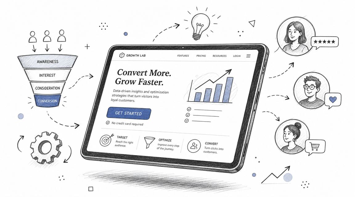
A landing page is a standalone page with a single conversion goal: capturing leads, selling a product or achieving a specific action. Its value doesn't lie in accumulating traffic, but in transforming that traffic into actionable results that are comparable by device, country and period, with metrics like visits, leads and subscription rate, as this analysis of the strategic use of landing pages explains.
The most common mistake is treating the landing as a trimmed-down version of the website. It isn't. A corporate site exists to cover many needs at once. A landing exists to isolate a business hypothesis and put it under real pressure.
That completely changes its value.
If a company launches a new commercial offer, a new category, new pricing or a new brand narrative, the landing page lets it test that thesis without contaminating the measurement with irrelevant navigation, complex architecture or parallel messages. That's where its strategic power lies.
Rule of thumb: if a page doesn't help make an investment decision, it isn't operating as a strategic asset.
A well-conceived landing also brings order to the internal conversation. It forces marketing, sales and leadership to answer uncomfortable but essential questions: what exactly is the offer, who is it for, what main objection needs resolving and what is the action that truly matters. That clarity reduces scatter. And when scatter is reduced, the efficiency of capital improves.
Many teams publish pages. Few build learning assets.
The difference lies in the purpose. An informational page adds content to the digital ecosystem. A landing page adds commercial intelligence. It lets you observe which value proposition sparks interest, which segment responds best, which source brings real intent and which friction is blocking the next step.
That's why the right conversation isn't "we need a landing for the campaign." The right conversation is "we need an environment that tells us what the market is buying and what it isn't."
At that point, the landing stops being a creative piece and becomes part of a growth discipline. If the board wants to understand why that connects with profitability, it's worth reviewing how the logic of conversion optimization, or CRO, works. The relationship is direct. Less friction, a better read on behaviour, faster decisions.
The difference between a landing page and a website isn't aesthetic. It's economic. A broad website distributes attention across multiple paths. A landing concentrates attention on a single decision. When a company pays to attract visits, that difference matters.
From a CRO perspective, the technical value of a landing page lies in reducing cognitive and navigational friction by concentrating the experience on a single goal, with a single CTA, a message aligned with the ad's intent and minimal distractions, as this explanation of a landing's role in conversion summarizes.
The website fulfills a broad corporate function. It presents the brand, credentials, services, support, content and navigation. That's fine. The problem appears when it's asked to handle performance campaigns as effectively as a structure designed for a single action.
That won't happen consistently.
When someone clicks an ad, they arrive with a specific expectation. If they land in an environment with too many paths, the company loses control over the decision sequence. The user starts to explore instead of act. And every additional step adds doubt, time and leakage.
The big problem with a generalist website isn't just user scatter. It's analytical scatter. When a campaign drives traffic to a multipurpose structure, attribution becomes murkier. Marketing sees visits. Sales asks for quality. Finance asks about return. No one answers clearly.
A landing, on the other hand, forces operational clarity.
A company doesn't lose efficiency only by investing badly. It also loses it when it takes too long to identify what isn't working.
That's why the comparison between a landing and a website should be read as a decision about speed of learning. When the goal is brand, breadth and exploration, the website rules. When the goal is performance, validation and clear attribution, the landing is usually the right tool.
For a more detailed assessment of that trade-off, it's useful to review this comparison between a landing page and a website.
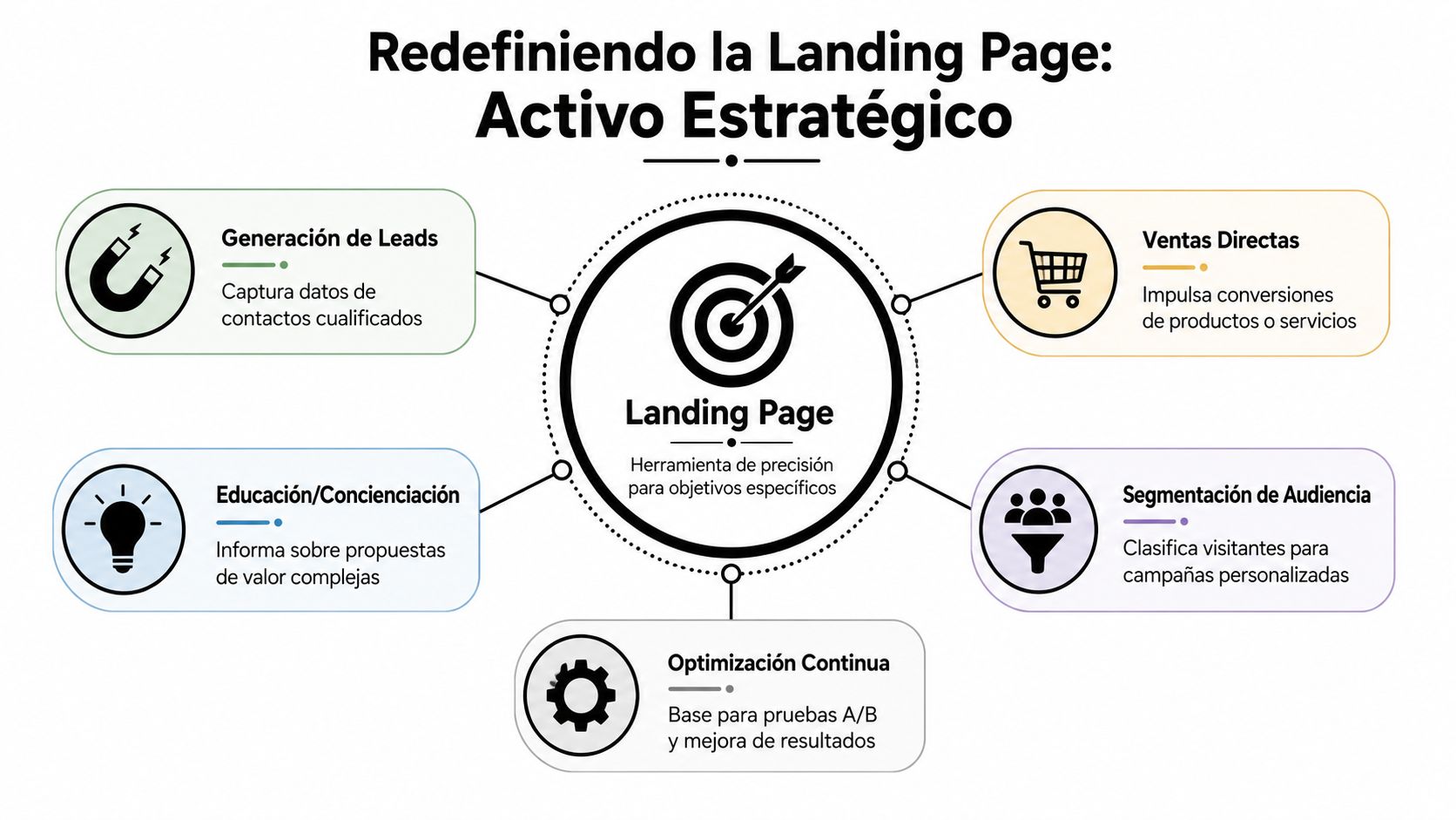
There's no such thing as "the" landing page as a single category. There are different structures for different jobs. Treating them all as equivalent leads to bad decisions. A company that needs commercial pipeline shouldn't use the same logic as a company that wants to prequalify demand for a launch.
Some landings serve to capture data. Others to push a purchase. Others to filter intent before sending people to a product page or a checkout. Others work as a market test for a new offer. The right choice depends on the type of decision the business needs to prompt.
The most useful way to think about this is as a portfolio of instruments.
Type of Landing PagePrimary Business ObjectiveKey Metric (KPI)Ideal Funnel StageLead generationBuild a base of qualified prospects for sales or nurturingLeads capturedDiscoveryClick-throughPrepare the user before moving to purchase or a formal requestClick to the next stageConsiderationSqueeze pageCapture the minimum possible data with a very specific offerSign-up rateDiscoveryProduct launchValidate interest and initial response to a new offerSign-ups, waitlists or signals of interestDiscovery and considerationWebinar or event pageDrive attendance and capture audiences with an identified problemRegistrationsConsiderationDirect sales pageClose a transaction or high-intent commercial requestConversions to sale or requestDecisionPre-order or waitlist pageMeasure traction before scaling operational or advertising investmentWaitlist sign-ups or stated intentEarly validation
The decision should start from the business question, not from the template.
If the company needs commercial volume for the sales team, a lead-generation landing makes sense. If the problem is that the user doesn't yet trust or understand the proposition, a click-through structure that educates before asking for a higher-commitment action is the way to go. If there's a new line of business and no one knows whether it will gain traction, a launch landing serves to validate interest without building the entire commercial machinery ahead of time.
Three criteria help avoid mistakes:
The point is simple. It's not about producing pages. It's about assigning the right structure to the right problem.
A high-performing landing doesn't convince by piling on elements. It convinces because each component serves a precise psychological and economic function. If a piece doesn't reduce uncertainty, doesn't increase clarity or doesn't speed up the decision, it's surplus.
The headline isn't a copy ornament. It's the first relevance filter. In seconds, the visitor decides whether that page answers the intent they arrived with. If the headline fails, the rest of the content barely matters.
The value proposition does another job. It translates the offer into an understandable benefit. Describing a product or service isn't enough. You have to make explicit what the person gains and why they should care now.
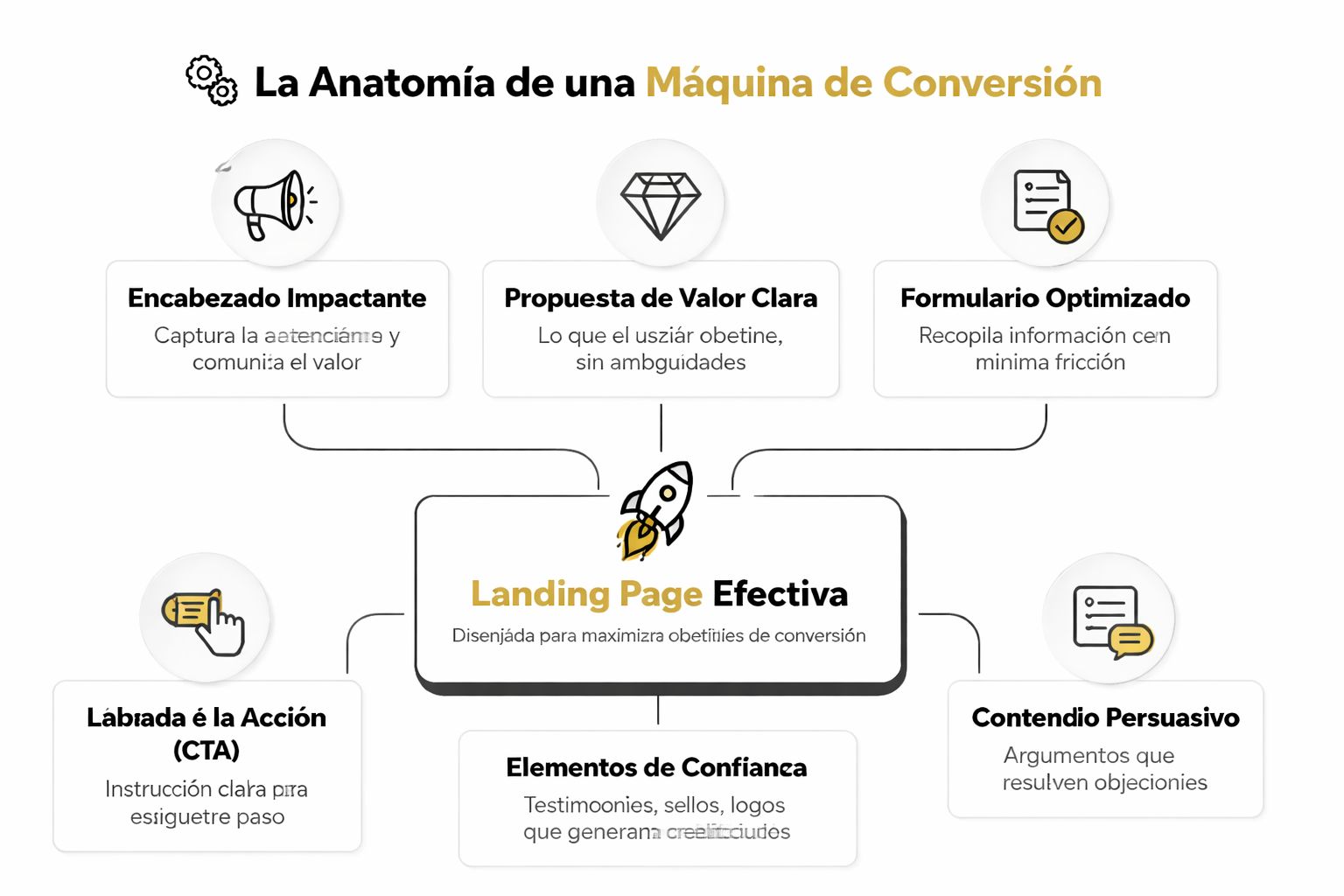
An executive reading of the functional anatomy looks like this:
The landing doesn't need to explain everything. It needs to clear up enough for the next step to feel logical.
Many companies still review their landings on desktop and fix mobile at the end. That's a bad sequence. Mobile optimization is critical because 80% of global traffic comes from mobile devices, and performance, form size and visual load directly influence conversion, according to this reference on creating landing pages that convert.
That has strategic implications, not just visual ones.
If most of the traffic arrives from mobile, then the business is competing on an interface of minimal patience. A confusing headline, a long form, a heavy image or a CTA that falls too far down aren't UX details. They're direct losses in commercial performance.
To dig deeper into the components that affect that response, it's worth reviewing this guide on the elements of a landing page that converts.
Companies tend to obsess over button colour and underestimate the management of perceived risk. That gets the priorities backwards. The user doesn't convert just because a CTA is visible. They convert when the offer seems credible, the promise seems specific and the cost of being wrong seems reasonable.
That's why trust elements work. Testimonials, logos, credibility signals, clear policies, precise language. They aren't cosmetics. They're mechanisms for reducing decisional friction.
A form also communicates. If it asks for too much, the implicit message is "I'm going to cost you time." If the page doesn't justify well why it's worth handing over data or moving forward, the abandonment rate rises. The ideal form isn't the shortest one out of dogma. It's the one that asks for exactly what the company can defend with its value proposition.
The "send everything to a landing" recommendation gets repeated too often because it sounds tidy. But it isn't always smart. There are scenarios where a simplified landing reduces trust, impoverishes exploration and ends up blocking sales that needed more context.
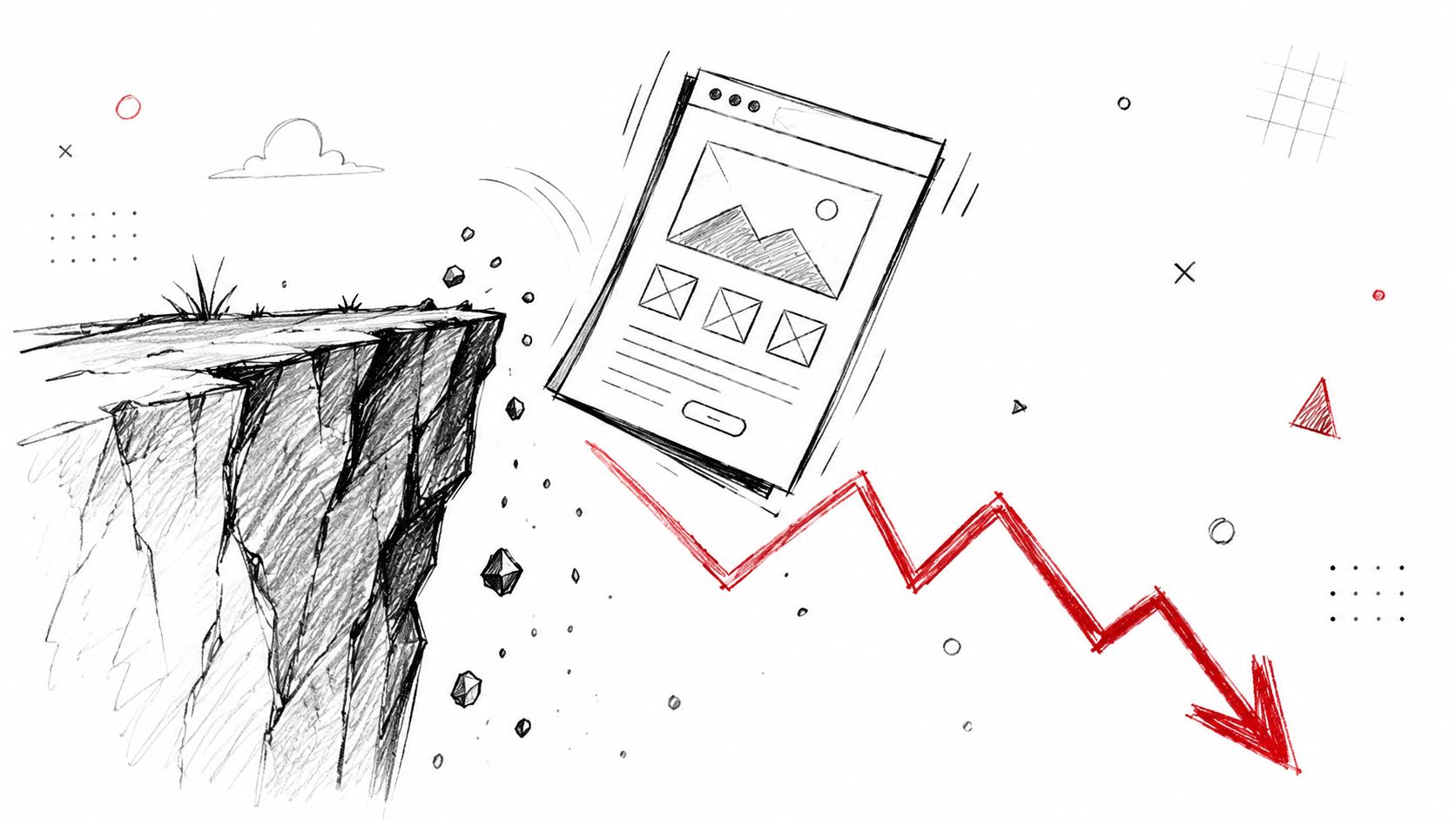
In Chile, retail internet reached sales of US$11.9 billion in 2024, with 6.2 million online shoppers, according to this reference on the strategic value of deciding between a landing and other structures. At that scale, assuming an isolated page always converts better is a dangerous oversimplification. More mature audiences compare, review, distrust and need different context depending on their intent.
A landing works very well when the intent is relatively clear and the desired action is specific. But when the user's search is exploratory, comparative or high-consideration, extreme reduction of options can work against you.
Think of queries with high ambiguity. Someone evaluating categories, alternatives, price tiers or differences between solutions doesn't always want a closed funnel. Sometimes they want evidence, breadth and a comparative structure. If the company responds with a landing that pushes a single action too quickly, it can look more interested in capturing data than in helping the person decide.
There are three typical cases where a landing can perform worse than a product page, a category or a comparison page.
The right structure isn't the one that pushes the most. It's the one that best accompanies the real intent level.
The following video helps look at that decision with a less dogmatic logic, more tied to user behaviour.
The leadership mistake here isn't technical. It's about reading demand. When a company forces a landing where the user expected to compare, it generates unnecessary friction. When it offers a category or a guide where the user was already ready to act, it dilutes conversion. The key isn't to use more landing pages. It's to use them where they maximize clarity, trust and decision speed.
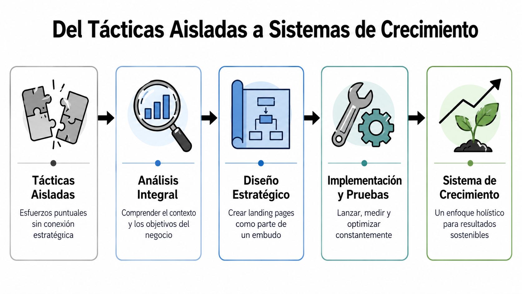
The most expensive mistake isn't having a mediocre landing. It's treating each landing as an isolated action. That practice produces campaigns, but it doesn't build a cumulative advantage. Each launch starts almost from scratch, each result is interpreted out of context and each adjustment consumes budget without greatly increasing the ability to decide better.
A serious company uses the landing page as commercial learning infrastructure. The page captures intent, exposes a value proposition to a specific audience and turns the market's response into a useful signal for the business. If that signal stays connected to analytics, CRM, acquisition channels and commercial priorities, the landing stops being a tactical piece and becomes a capital-efficiency asset.
The practical difference is simple. In an isolated model, marketing publishes pages and reports conversions. In a growth system, the company formulates hypotheses, measures real reaction and uses that learning to reallocate budget, adjust messages and correct the offer.
That forces you to raise the level of the conversation. The question stops being whether a page converts well or badly. The right question is what the company is learning about demand, friction, segmentation and message sensitivity. That's where the real value appears.
A well-conceived system of landing pages usually operates with this logic:
Investment decisions change.
The company discards weak ideas sooner, makes better use of every visit and reduces its dependence on internal criteria that never faced the market. That has a direct financial impact. Less spending on messages that don't resonate. Less traffic wasted on poorly calibrated propositions. More speed in finding where intent with commercial value actually exists.
Technology matters less than many boards believe. WordPress, Webflow, Shopify or any other stack are operational means. What defines the advantage is something else. Speed to test, clarity to measure and discipline to turn every interaction into an improvement of the whole system.
Within that framework, Bigbuda works on landing pages inside growth systems connected with UX, data, continuous experimentation and artificial intelligence. The point isn't to produce more pages. The point is to design a structure that turns traffic into two results at the same time: revenue and proprietary knowledge.
An isolated landing can capture demand. A system of landing pages helps you understand, prioritize and scale it with less waste.
Companies that operate this way tend to allocate their budget better because they no longer assess the landing as a creative cost or as campaign support. They assess it as an instrument for reducing commercial uncertainty. And reducing uncertainty, in any serious boardroom, is always worth more than publishing one more page.
The question of what a landing page is falls short for serious leadership. Defining it as a conversion page is correct, but insufficient. Its strategic value appears when it's understood as a commercial intelligence instrument.
A well-thought-out landing lets you validate a value proposition, measure response by segment, detect friction in decision-making and separate useful signals from noise. That makes it a capital-efficiency tool. Every visit can deliver a conversion, but also a read on the market. And that second layer is usually the most valuable.
The companies that grow most consistently aren't the ones that publish the most pages. They're the ones that turn their digital presence into a learning system. There the landing plays a central role because it offers focus, traceability and speed. It doesn't replace the website or the brand strategy. But it does solve something few digital pieces solve so well: transforming commercial uncertainty into actionable evidence.
If the board wants a concrete conclusion, here it is. A landing page shouldn't be assessed as a campaign cost. It should be assessed as a business asset. When it's well aligned with intent, offer and measurement, it doesn't just produce leads or sales. It produces judgment for deciding better what to sell, to whom, with what message and with what digital structure.
If your team needs to convert more with the same traffic and treat landing pages as growth assets instead of isolated pieces, Bigbuda can help you structure a system of conversion, learning and continuous optimization for eCommerce and B2B/B2C businesses.
Related article: 9 common mistakes on landing pages.