


Solutions
Explore how to grow
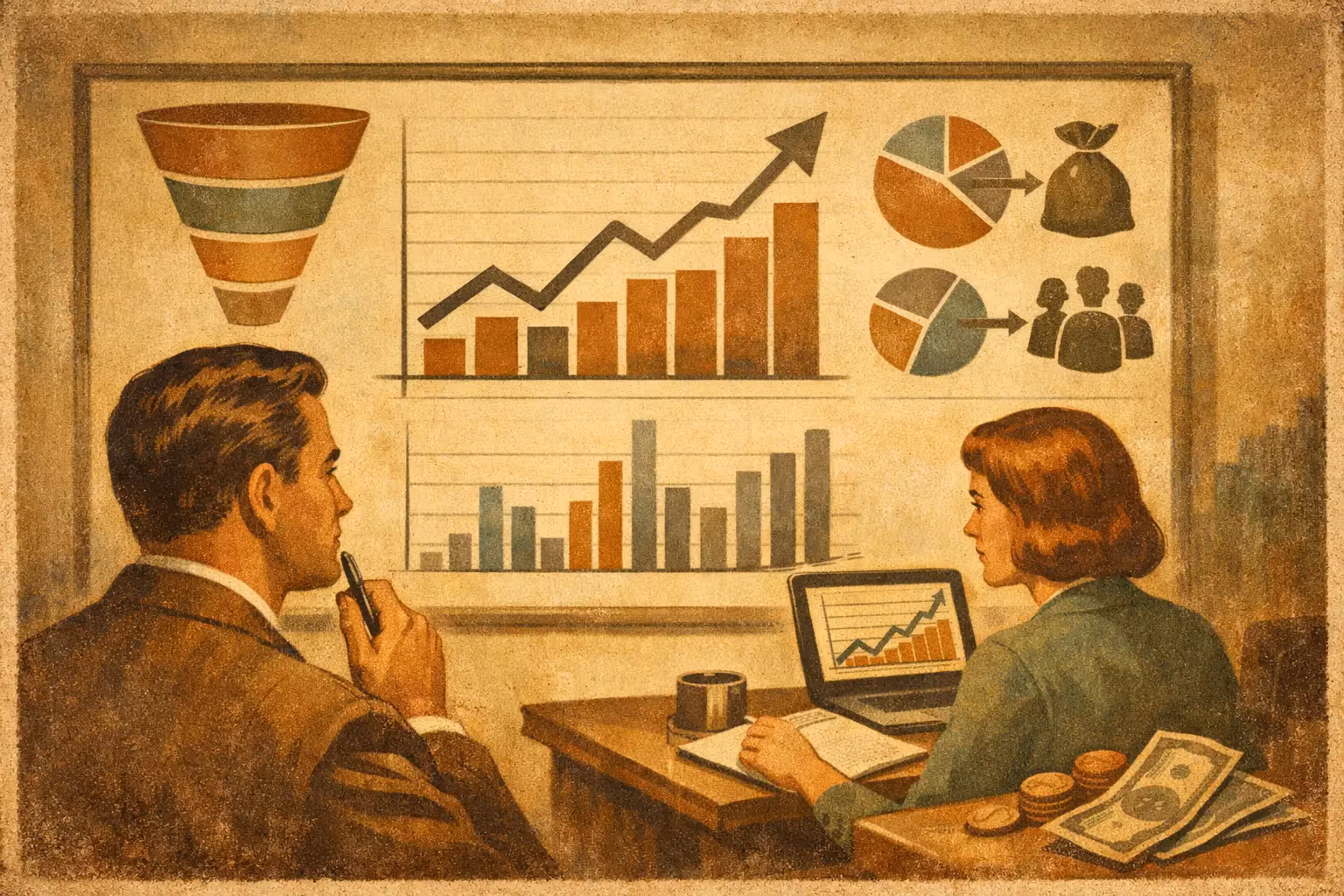
If your team looks at sales in one place, traffic in another and campaigns on a third platform, you don't have commercial clarity. You have fragments. And when data arrives fragmented, so do decisions.
A digital conversion dashboard isn't there to “show metrics.” It's there to answer one specific question: where is money being lost, and what adjustment can improve the result with the same traffic? That difference matters, especially for companies that already invest in acquisition and don't want to keep growing on ad spend alone.
Most dashboards fail for one simple reason. They measure activity, but not performance. They show sessions, clicks, impressions and reach, but they don't explain which channel converts best, which page slows progress or where in the funnel purchase intent drops off. A useful dashboard doesn't accumulate data. It orders priorities.
In practical terms, it connects marketing, UX, technology and sales into a single business view. Knowing how many people reached the site isn't enough. What matters is what percentage moved forward, which source generated real customers, how much that conversion cost and where you can intervene to improve.
That changes the conversation inside the company. Instead of debating opinions, the team can review evidence. If a landing page receives quality traffic but converts below average, the problem probably isn't the campaign but the value proposition, the form, the speed or the page architecture. If a channel brings less volume but closes better and with a higher ticket, it deserves more attention than another with flashier numbers and a worse return.
That's why a good dashboard isn't just analytical. It's also operational. It should help you make decisions this week, not just review last month's reports.
The most common mistake is building a dashboard full of KPIs that sound good in a presentation but do nothing to optimize conversion. A well-designed digital conversion dashboard starts with the metrics that affect revenue.
The overall conversion rate gives context, but on its own it's not enough. It's better to break it down by goal type: purchase, form submission, demo request, click to WhatsApp, booking or qualified lead. Not all conversions are worth the same.
If you mix micro-conversions with commercial results, the dashboard becomes misleading. A rise in clicks may look like an improvement even though sales are flat. That's why each event needs a clear hierarchy.
Seeing “organic traffic,” “paid” or “social” as broad blocks isn't enough. What's useful is comparing volume, conversion rate, cost per acquisition and value generated by each channel. That's how you understand which source drives profitable growth and which only inflates visits.
In service businesses, it also helps to distinguish between channels that generate forms and channels that generate real sales opportunities. There's a big difference between lead quantity and commercial quality.
Conversion rarely drops across the whole site at once. It usually breaks at specific points. That's why the dashboard should show which pages capture demand, which introduce friction and which sustain the decision.
In ecommerce this can show up in categories, product pages, cart and checkout. In services, in the home page, service pages, case studies and campaign landing pages. When the data is broken down by URL or page type, the real optimization opportunity appears.
A single final rate hides too much. The strategic move is to see progress step by step. Session, product or service view, form started, submission, checkout started, payment completed. Every business will have its own stages, but the principle is the same: identify leaks.
This point is key because it lets you prioritize. If the biggest break is between cart and checkout, redesigning the home page makes no sense. If the drop-off happens before the first relevant click, the problem is probably in the proposition, the navigation or the load speed.
Not as decoration, but as a decision criterion. Many conversions fall on mobile because of UX problems that don't exist on desktop. There are also differences by time of day, by active campaign or by market.
In Chile and Latin America this is especially relevant when traffic comes mixed from different geographies, currencies or buying behaviors. If the dashboard doesn't let you filter, it ends up hiding real problems inside a comfortable average.
A useful dashboard doesn't start with the tool. It starts with the business questions. If the goal is to increase sales with the same traffic, then the dashboard should show where to intervene first to move that result.
The right questions: which channel converts best, where the form drops off, which landing page is below benchmark, which device performs worst, which source brings more profitable customers. The structure is defined from there.
The wrong questions: which metrics “we should see,” which charts look nicer or which fields come available by default on the platform. That approach produces dashboards full of noise.
Management doesn't need to review 40 events. It needs to understand trend, efficiency and opportunities. The marketing or CRO team does need more detail to execute improvements.
That's why it helps to separate an executive view, with commercial KPIs and evolution, from an operational view, with funnels, pages, segments and behavior. Mixing both on a single screen usually ends badly. It's either too shallow or too technical.
An isolated figure says little. A conversion rate of 1.8% can be good or bad depending on the industry, the channel, the average ticket and the period analyzed. What provides context is comparing against previous periods, equivalent segments and commercial goals.
It also helps to cross conversion with speed, traffic source and behavior. Sometimes the drop isn't explained by the offer, but by a slow load on mobile or by a campaign poorly aligned with search intent.
The first is measuring only the end of the funnel. If you look solely at closed sales or leads, you arrive at the problem too late. The second is relying on poorly implemented events. A dashboard with incomplete tracking produces wrong decisions that look precise.
Another common mistake is not integrating real commercial data. If the dashboard ends at the submitted form but isn't connected to lead quality or closed sales, you can end up optimizing volume instead of profitability.
It also happens often that the dashboard is designed once and never adjusted again. But businesses change. Traffic sources change, campaigns change, the site changes and user behavior changes. The dashboard must evolve with that reality.
The tool matters less than the data strategy. Looker Studio, GA4, CRM, heatmaps, ecommerce platforms and advertising systems can coexist well if there's a clear definition of goals and events.
GA4 helps you understand behavior and funnels, but it isn't always enough on its own. A CRM organizes the commercial value that comes after the lead. In ecommerce, the platform can show revenue and transactions, though it doesn't always explain the reason for friction. Behavior tools add context but don't replace business analysis.
The key isn't having more software. It's having a coherent reading. If every platform tells a different story, the problem isn't a lack of data. It's a lack of measurement architecture.
A dashboard doesn't improve conversions just by existing. It improves conversions when it's used to detect hypotheses, prioritize experiments and measure impact. If the dashboard shows a sharp drop on mobile, that should open a UX review. If a landing page converts well below the traffic it receives, it should go straight into an immediate improvement of structure, copy, trust or speed.
That's the point where data stops being a report and turns into growth. Same traffic. Better results.
At Bigbuda we see it often: companies with solid acquisition investment but little clarity about which part of the journey is holding back the sale. When the dashboard organizes that reading, optimization stops being intuitive and starts generating measurable impact.
If your digital decisions today depend on several scattered reports, you probably don't need more data. You need a system that tells you clearly what to fix first. That's where real improvement begins.
Related article: What CRO Is in Marketing and Why It Sells More.