










Solutions
Explore how to grow
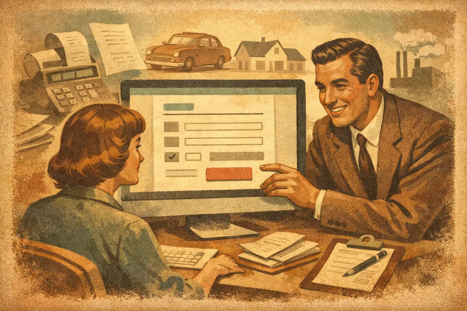
If your sales team gets traffic but few useful requests, the problem often isn't the ads or the SEO. It's the page. A good quote landing page example doesn't just look “nice”: it filters better, reduces friction and turns visits into real sales opportunities.
In service businesses, construction, software, logistics, manufacturing or B2B solutions, the quote landing page plays a critical role. It shouldn't entertain or tell the whole brand story. It should drive a specific action: getting the user to complete the form with clear intent and enough information to move forward.
A quote landing page works when it aligns three things: the commercial promise, the user's expectation and how easy it is to take the next step. When one of those pieces fails, conversion drops or the number of bad leads rises.
The most common mistake is designing it as if it were a condensed corporate page. That creates noise. If someone arrived looking for a price, a proposal or an evaluation, they don't want to scroll through five generic blocks about the company before understanding what will happen if they leave their details.
The right logic is simpler. In just a few seconds, the page should answer four questions: what you offer, who it's for, why to trust you, and how to request the quote. Everything else is secondary.
Let's imagine a company that sells industrial HVAC services. A user arrives from Google Ads with high intent. They're looking for a specific solution, comparing suppliers and wanting speed. The landing page should have a structure focused on moving that decision forward.
The first screen needs a direct headline. Not a creative one. Something like: “Get a quote for your industrial HVAC project in 24 hours.” That reduces uncertainty and sets a clear timeframe.
Below it, a short line can reinforce the differentiator: coverage, technical experience, response times, certifications or the type of projects handled. To the right or below, depending on mobile, sits the form, visible from the start.
If the service is highly complex, it helps to add a small trust line: “Free technical consultation” or “Commercial response the same business day.” That detail can increase the intent to make contact because it lowers perceived risk.
A lot of performance is defined here. A form that's too short brings volume but can lower quality. One that's too long reduces conversions. There's no universal rule. It depends on the ticket size, the sales cycle and how much the sales team needs to know to qualify.
On a quote landing page, it usually makes sense to ask for name, company, email, phone and a brief description of the requirement. If the business needs to filter, you can add fields like project type, company size or estimated range. The key is that every field has a commercial reason.
It also helps a lot to replace the classic “Submit” with a more specific CTA, such as “Request a quote” or “I want a proposal.” It seems minor, but it improves clarity and expectation.
Trust isn't left for the end. If the user is going to hand over their information, they need quick signals. Client logos, years of experience, number of completed projects, certifications or a verifiable rating help reduce friction.
In B2B services, a small block with 2 or 3 concrete case studies usually performs better than a long section of institutional text. For example: “+120 projects completed,” “Service in Santiago and the regions” or “Response in under 4 business hours.” Specificity sells more than adjectives.
Many people don't complete a request because they don't know what comes next. An effective quote landing page clarifies the next step. A simple block is enough: we receive your requirement, a specialist reviews your case, and we send you a proposal or schedule a call.
That lowers anxiety and improves the perception of a well-organized sales process. In competitive markets, answering that question before it comes up can make the difference.
After the form and the trust signals, it's worth including one or two blocks that address frequent objections. Not an endless page. Just enough to clear up the main doubt.
If the user fears delays, talk about timelines. If they fear poor execution, show experience. If they're comparing several suppliers, explain your approach or methodology. A quote landing page doesn't need to say everything, but it does need enough to justify the contact.
Imagine this sequence on a high-performing page:
Headline: “Request a quote for your web project and get a clear proposal.”
Subhead: “We design sites built for conversion, speed and commercial growth. We assess your case and reach out with a realistic solution.”
Visible form: name, company, email, phone, project type and message.
Immediate trust signal: “Over 10 years building digital platforms focused on sales.”
Benefits block: strategic design, fast loading, technical SEO and a CRO approach.
Process block: initial analysis, proposal, kickoff.
Proof block: testimonials, logos or metrics.
Final CTA: “Book your meeting now.”
The point isn't to copy this structure literally. The point is to understand the user's intent and order the information to make the decision easier.
The first is asking for too much information before building trust. If your brand isn't widely known and the form looks like an internal sales sheet, many visitors will drop off.
The second is using vague copy. Phrases like “comprehensive solutions” or “service of excellence” don't help anyone request a quote. The user needs to understand what you solve, how you work and what they can expect.
The third is failing to adapt the landing page to the traffic source. If someone comes from a campaign for “ecommerce development” but lands on a generic digital services page, friction rises. Message continuity directly affects conversion.
The fourth mistake is overlooking the mobile experience. Today a large share of requests start on a smartphone, even in B2B businesses. If the form is awkward, the CTA isn't visible or the site loads slowly, opportunities are lost without the team noticing.
Improvement doesn't come from intuition. It comes from data. The first step is to measure where conversion drops: on the first screen, in the form, on mobile, or after a certain block. Without that visibility, any redesign is just a gamble.
A good practice is to test concrete hypotheses. Changing the headline for one with a response timeframe, reducing fields, moving testimonials higher or adding a process block are adjustments that can have real impact. Sometimes a 15% or 20% improvement in conversion rate doesn't require rebuilding the whole site, only fixing critical friction.
Lead quality matters too, not just volume. If one variant generates more forms but fewer closes, it isn't better. That's why it's worth looking at effective contact rate, meetings booked and sales opportunities, not just surface-level conversions.
Creating a separate landing page isn't always the best solution. If the service has low complexity and the site already has a solid page with good organic traffic, optimizing that same URL may be enough.
But when there are paid campaigns, specific services or distinct segments, a dedicated landing page usually wins. It lets you tailor the message, offer, social proof and form to the intent. That improves relevance and typically raises conversion.
At Bigbuda we see this pattern often: companies that invest more in traffic when they haven't yet solved their main leak point. Same traffic. Better results. That logic starts with the right page.
If you're going to build a quote landing page, don't ask only for design. Ask for a conversion strategy. That means defining the objective, the traffic source, the value proposition, the content structure, measurement events and lead-quality criteria.
It's also worth demanding a commercial perspective. The page shouldn't win internal design awards. It should generate more qualified contacts and help close. That difference completely changes how it's written, designed and optimized.
A good quote landing page doesn't overpromise. It organizes the decision better, answers key objections and makes it easy to move forward. When that happens, the impact shows quickly: less leakage, better leads and a digital channel that starts working like a serious salesperson.
Related article: How to create landing pages that actually convert.
A direct headline that sets a clear response timeframe, a form visible from the start, trust signals right next to it, a short block explaining what happens after the request, and one or two sections answering the main objections. Every element exists to move the decision forward, not to describe the company.
There is no universal rule. It depends on the ticket size, the sales cycle and what the sales team needs to qualify. Name, company, email, phone and a brief description of the requirement usually works. Add fields like project type or company size only when each one has a commercial reason.
Because volume is being measured instead of quality. A variant that generates more forms but fewer closes is not better. Look at effective contact rate, meetings booked and sales opportunities. Vague copy such as comprehensive solutions also attracts contacts who never understood what you actually solve or how you work.
If the service has low complexity and the site already has a solid page with good organic traffic, optimizing that same URL may be enough. When there are paid campaigns, specific services or distinct segments, a dedicated landing page usually wins, because message, offer, proof and form match the intent.
Asking for too much information before building trust, using vague copy, and failing to adapt the page to the traffic source that sent the visitor. Overlooking mobile is the fourth: a large share of requests start on a smartphone, even in B2B, so opportunities are lost without the team noticing.
Ask for a conversion strategy, not only design. That means defining the objective, the traffic source, the value proposition, the content structure, the measurement events and the lead-quality criteria. Demand a commercial perspective too: the page should generate more qualified contacts and help close, not win design awards.