


Solutions
Explore how to grow
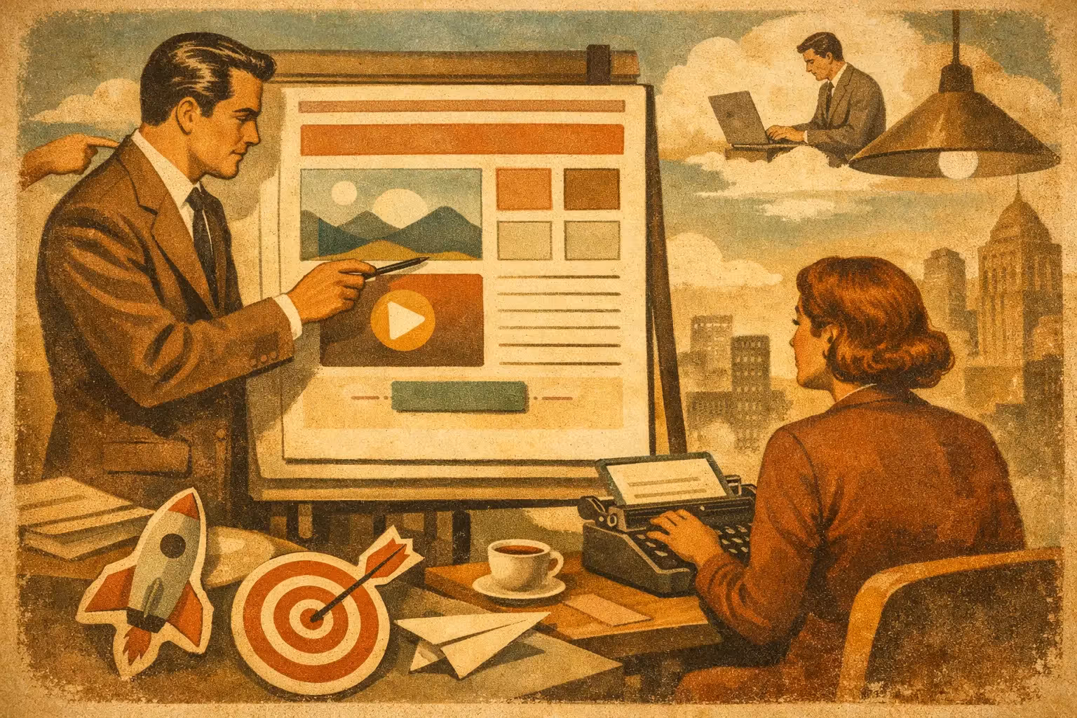
A landing page doesn't fail because it looks outdated. It fails because it doesn't get the user to take the next step. If you're looking for how to design an effective landing page, the right question isn't just which design to use, but which elements reduce friction, build trust, and drive conversion.
If you want to go deeper, check out our web design that converts.
For companies already investing in traffic, this is critical. Every click that lands on a poorly structured page drives up acquisition costs and lowers the return on campaigns, SEO, or sales efforts. Same traffic. Better results. That's the real logic behind a well-designed landing page.
An effective landing page doesn't try to say everything. It has one job: to turn a specific intent into a concrete action. That action might be a quote, a purchase, a booking, a trial, or a download. When a page tries to accomplish five goals at once, it usually doesn't do any of them well.
That's why the first criterion isn't aesthetic — it's strategic. Before thinking about colours, images, or animations, you need to define exactly what the main conversion is, what kind of traffic will reach the page, and which objections you need to resolve so the visitor moves forward.
In CRO, this matters because every traffic source arrives with a different level of intent. A search campaign with high commercial demand is not the same as a colder social media campaign. A manager looking for an urgent solution doesn't respond the same way as someone who's just starting to compare options. The structure has to adapt to that context.
Design starts long before the layout. It begins by answering four simple questions: what you offer, who it's for, why they should choose you, and what they need to do now. If a page doesn't answer that in a few seconds, the user reads it as noise.
The top block, or hero, drives a large share of performance. That's where the main benefit needs to be clear — not a clever line that forces interpretation. Headlines that convert tend to promise a specific result or solve a concrete problem. Below it, a short supporting line helps ground the offer, and a visible call to action marks the next step.
A common mistake is filling that first block with corporate copy, sliders, or generic office images. It might look fine in an internal presentation, but it doesn't help conversion. People don't want to guess what you do. They want to know quickly whether this is for them or not.
It's also worth keeping the ad and landing page consistent. If a campaign promises an audit, a demo, or a discount, the page has to deliver exactly that promise. When the message changes between the ad and the destination, trust drops immediately and the bounce rate goes up. It seems like a small detail, but it usually has a direct impact on cost per lead.
There's no single formula, but there is a logic that repeats across the best-performing pages. First you capture attention with a clear value proposition. Then you explain value with a focus on benefits. After that you reduce objections with proof, and you close with a simple action.
The headline has to be understood in seconds. The more ambiguous it is, the worse. "Innovative solutions for your business" sounds fine, but it doesn't convert because it says nothing concrete. A promise focused on sales, speed, bookings, or lead generation, on the other hand, gives direction.
Specificity tends to win. If you can talk about results, timelines, segments, or use cases, even better. It doesn't always pay to overdo it with numbers if they aren't backed up. Credibility carries more weight than an inflated promise.
Many landing pages describe tools, features, or internal processes. The user, on the other hand, is weighing impact. They don't buy an integration for the integration itself. They buy less manual work, more commercial control, or a faster operation.
That doesn't mean dropping the technical side. It means ordering it. The benefit first. Then, where it fits, the technical support that makes it possible. This approach improves understanding, especially for complex services or B2B solutions.
If you're asking for a business action, you have to justify why someone should trust you. Testimonials, client logos, reviews, result figures, real case studies, certifications, or years of experience all help reduce uncertainty. Not every business needs the same elements, but almost none should leave them out entirely.
There's an important nuance here: generic social proof carries little weight. A testimonial without context is worth less than one that explains the problem, the solution, and the result. The same goes for phrases like "over 100 happy clients" if it isn't clear in which industry, with what kind of projects, or under what standard.
The CTA has to be seen, understood, and repeated at logical moments. If your goal is to book a meeting, don't mix that CTA with "read more," "view services," and "subscribe." Every secondary action competes with the main one.
The button copy matters too. "Submit" is weak because it doesn't explain any value. "Request an audit," "Book a diagnostic," or "Get a quote now" work better when they're aligned with the offer.
An effective page doesn't need to look empty, but it does need hierarchy. The design should help understanding, not distract. Enough spacing, clear contrast, legible typography, and a tidy structure let the information flow.
Visual excess tends to work against you. Auto-playing videos, unnecessary animations, immediate pop-ups, or overly cluttered blocks add friction. On desktop they may be tolerated more, but on mobile they hit the experience hard.
Images also have to work for conversion. If they show the product, the service in action, the real team, or the expected result, they add value. If they're just stock photos with no direct connection, they take up space but don't help the decision.
Today a large share of traffic comes from phones, yet many pages are still designed with desktop in mind first. That gap costs conversions. On mobile, users scan faster, tolerate less waiting, and bail sooner if something isn't clear.
That's why the mobile version needs real priority. Short headlines, large buttons, simple forms, and blocks that are easy to move through with your thumb. It's also worth reviewing the page's overall length. A long landing page can work, but it has to justify every section. If it forces scrolling without clear progress, it loses momentum.
Speed is another decisive factor. A slow page doesn't just hurt technical SEO. It also destroys commercial intent. If the offer is good but the page is slow to load, part of your traffic will never see the content. In competitive scenarios, that means giving away opportunities.
A long form filters, but it can also scare people off. A very short one converts more, though it sometimes lowers quality. The decision depends on the type of business, the average ticket size, and the volume of demand.
If you sell a complex or high-value service, it can make sense to ask for more context. If you're trying to increase the volume of contacts from campaigns, you probably want to reduce the number of fields. There's no universal answer. What matters is that every field has a clear reason. If it doesn't contribute to sales, automation, or commercial qualification, it's unnecessary.
It also helps to pair the form with security signals and context. Explaining what will happen after submission, how soon they'll get a reply, or who the offer is meant for reduces anxiety and improves the submission rate.
Publishing a landing page isn't the end of the work. It's the start of measuring. Heatmaps, session recordings, scroll rate, click rate, form submissions, and traffic source all help you spot the real bottlenecks.
Sometimes the problem is in the headline. Other times, in the value proposition. In many cases, the drop-off happens because of technical friction, load times, or unclear forms. Without data, you end up guessing. With data, you optimize.
Continuous improvement usually comes from specific changes, not full redesigns every month. Adjusting a CTA, simplifying a block, changing the order of a section, or strengthening a piece of social proof can move results more than you'd expect. In CRO projects, that cumulative approach tends to be more profitable than rebuilding everything from scratch.
Many companies judge a landing page by whether it "looks good." The problem is that a page can look flawless and still convert poorly. Pretty design isn't always effective design.
A truly good landing page aligns message, intent, experience, and action. It makes it easy to understand, trust, and move forward. If it also loads fast, works well on mobile, and is built to be measured, it becomes a commercial asset, not a decorative piece.
If your business is already getting visits and isn't converting the way it should, the problem is rarely just traffic. Often it's in the landing page itself. And that's where a strategic design decision can change the entire outcome of your digital investment.
Designing better isn't about adding more elements. It's about keeping only what drives conversion and removing everything that holds it back.
Related article: 9 elements of a landing page that converts.