


Solutions
Explore how to grow
There are sites that get visits, have a good offer and still don't sell what they should. The problem often isn't the product or the traffic. It's perception. If a page raises the slightest doubt in the first few seconds, conversion drops.
If you want to go deeper, take a look at our AI for companies in Chile.
That's where visual trust elements that drive conversions come in. They aren't decorations or aesthetic touches added out of habit. They're signals that reduce perceived risk, validate the commercial proposition and help a user move forward with more confidence toward a purchase, a quote or a contact.
In CRO, this matters because trust isn't declared. It's designed.
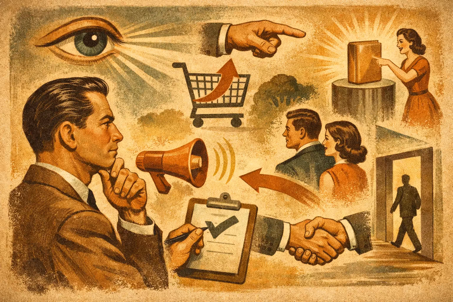
They're visual components that show the user, without demanding too much cognitive effort, that they're dealing with a legitimate, professional company capable of delivering on what it promises. We're talking about social proof, graphic consistency, interface clarity, security signals, real faces, external validations and micro-details that convey control.
Not all of these elements carry the same weight in every business. In an ecommerce store, trust can depend heavily on payment methods, reviews and visible policies. In a service company, authority, real cases and a clear proposition usually matter more. That's why copying formulas isn't enough. You have to align these signals with the type of decision the user is evaluating.
First, a useful warning. Adding badges, testimonials or icons won't fix a weak proposition. Nor does it make up for a slow, confusing site with poorly designed forms. Visual trust amplifies a solid foundation. If the offer doesn't convince or the experience frustrates, the effect will be limited.
That's why the best results appear when these elements work alongside a clear conversion architecture, low load times and messages oriented to real intent.
Social proof is still one of the most effective signals for reducing friction. But there's a big difference between showing random logos and presenting evidence that answers a concrete doubt.
A good testimonial doesn't just say the service was good. It says what the problem was, what changed and what result was achieved. A short case study with figures such as an increase in leads, an improvement in conversion rate or growth in sales carries far more weight than a generic phrase.
Client logos also help, especially in B2B services, but they work better when they're recognizable and well integrated into the context. If they appear without explanation, they add less. If they reinforce a section where you're already demonstrating experience, they raise credibility.
Specificity. The more concrete the proof, the less effort the user needs to make to believe it. "We increased form conversion by 28%" is worth more than "we achieved excellent results".
Most users don't evaluate design with technical language, but they do detect inconsistencies within seconds. A site with mixed fonts, uneven image quality, messy spacing or unclear buttons conveys improvisation. And improvisation sells little.
Visual consistency creates a silent sense of control. If the brand looks organized, the user assumes the operation is too. This applies to colours, hierarchies, button styles, icons, margins and content structure.
It's not about the site looking "pretty". It's about it looking serious, stable and easy to use. In categories where the ticket is high or the service involves risk, this point matters even more.
Users don't need a cybersecurity course to decide whether to trust. Small, well-placed signals are enough. An SSL certificate, recognized payment methods, return policies, clear shipping, data protection and reassuring messages in forms or checkout.
The common mistake is hiding this information in the footer or leaving it only on legal pages. If the user is about to pay or hand over their data, the signal should appear close to that action. Trust works best when it arrives just before the doubt.
In long forms, payment processes and contact pages. There, any uncertainty makes the user postpone the decision or abandon it entirely.
Overly obvious stock images have a direct problem: they look fake. And when a brand looks fake, the whole message loses strength. This is especially critical in service companies, healthcare, education, consulting and technology.
Showing a real team, real offices, real products or real screenshots of the service increases the perception of authenticity. You don't need a huge production. You need coherence. An honest, well-executed photo usually converts better than a perfect but impersonal image.
In ecommerce, this applies too. Your own photography, clear zoom, different views, context of use and a good product presentation reduce the sense of risk. If the customer can't touch the product, the image has to make up for that distance.
A site can have good information and still lose conversions if it forces the user to search too much. Trust also depends on how easy it is to understand where I am, what's being offered and what I need to do now.
An effective visual hierarchy organizes content by intent. First the value proposition. Then the main benefit. After that, the evidence. Finally, the action. When that sequence is well worked out, the page feels more trustworthy because it seems designed to help, not to confuse.
This includes clear titles, visible calls to action, well-separated blocks, adequate contrast and less visual noise. In many cases, converting more doesn't depend on adding elements, but on removing distractions.
Awards, certifications, ratings, verified reviews or media mentions can be powerful visual trust elements that drive conversions, but only if they make sense within the commercial process.
Placing a badge without explaining why it matters adds little. By contrast, if a certification backs a critical capability of the service or if a verified review appears right before a frequent objection, the impact rises.
You also have to watch relevance. A very old, little-known validation that's disconnected from the current decision can look decorative. And decorative rarely moves results.
Visual trust doesn't live only in images or badges. It also appears in short pieces of text that accompany an action. A button that says exactly what will happen next, a note under the form clarifying response times or a message indicating "no obligation" can reduce resistance immediately.
The same goes for the interface. If a field flags errors clearly, if the checkout process shows progress or if contact options are visible, the user feels greater control. And perceived control is trust.
This kind of detail often goes unnoticed in meetings, but it has a direct impact on conversion because it tackles small frictions that, when they add up, stall decisions.
It's not advisable to implement everything at once. The best decision depends on the type of page, the source of the traffic and the user's level of intent. On service pages with cold traffic, a clear proposition together with authority and real cases usually performs better first. In ecommerce, reviews, visible policies and checkout security normally carry more weight.
If the site already gets traffic and has data, the priority should come from real behaviour. Heatmaps, recordings, scroll analysis and funnels show where the doubt appears. That's where trust elements should be reinforced.
When there's no measurement, the temptation is to decide based on internal taste. That approach usually leads to sites that are visually correct but commercially weak. Trust isn't evaluated by opinion. It's validated in results.
Many companies do have experience, relevant clients and a solid operation. The problem is that their site doesn't communicate it. It looks generic, ambiguous or outdated. And when that happens, the market doesn't judge what the company is. It judges what the page suggests.
That mismatch costs sales, especially when the traffic already exists and the brand competes for attention against alternatives that may not be better, but do look more credible.
That's why a serious conversion strategy doesn't start only by bringing in more visits. It starts by checking whether the site is sending the right signals so those visits trust and act. A big part of growth is decided in that difference.
If your site already has traffic but isn't closing at the level it should, you probably don't need more noise. You need more clarity, more evidence and better visual signals at the exact moment. Same traffic. Better results.
Reviews and testimonials, client logos, security badges, clear guarantees and real photos of the product or team.
Because most purchase decisions depend on feeling safe: trust reduces friction and increases conversions.
Close to decision points: next to the CTA, in the checkout and on product pages.